🔶 Admin Side
B2B Web
UI Showcase
Three features.
One shared problem.
Dashboard, Affiliate Profile, and Marketing Tools - each redesigned as part of the full admin side overhaul. Different surfaces, same root cause.
Ido Alony
Projects

About

Resume

Feature 01
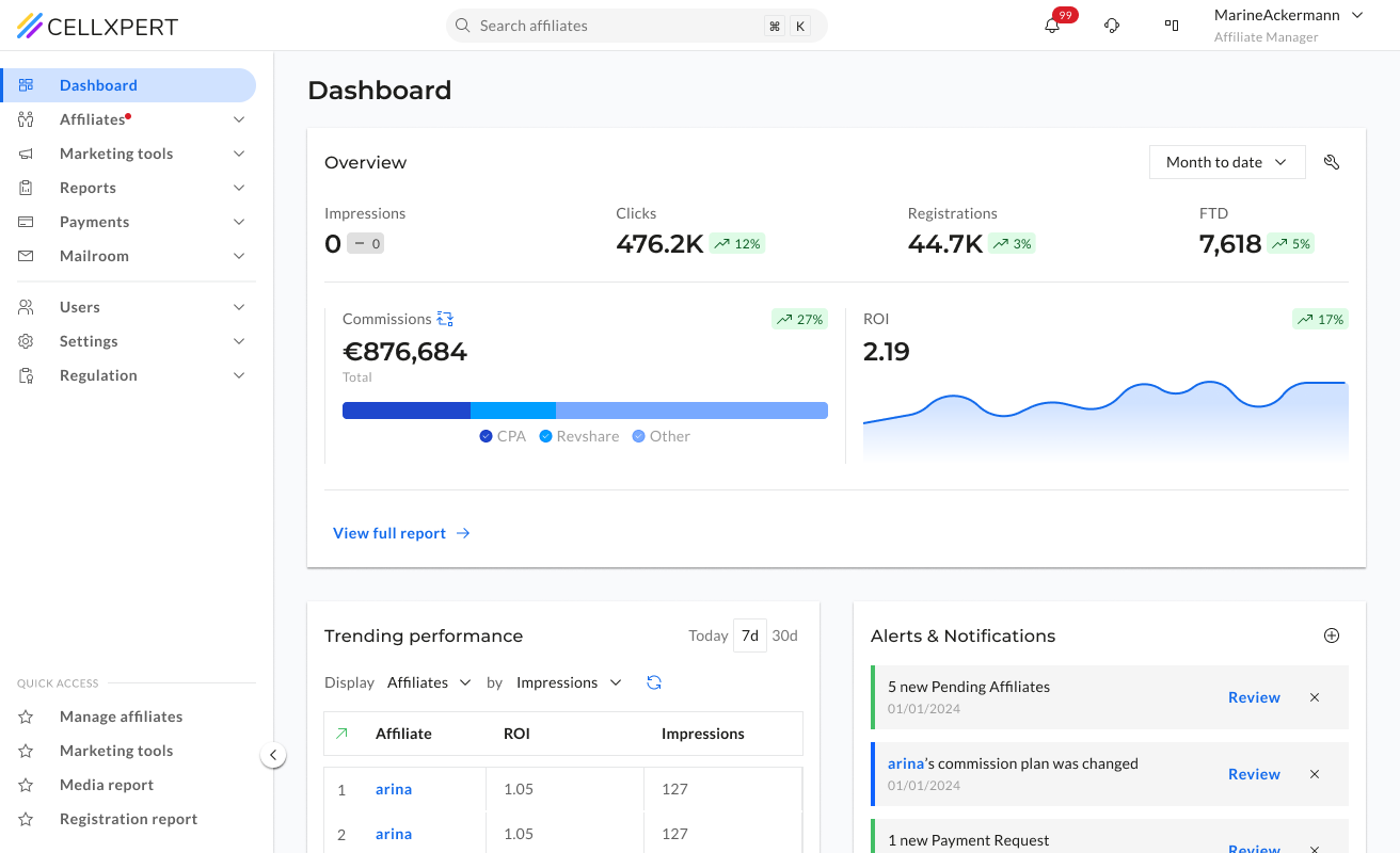
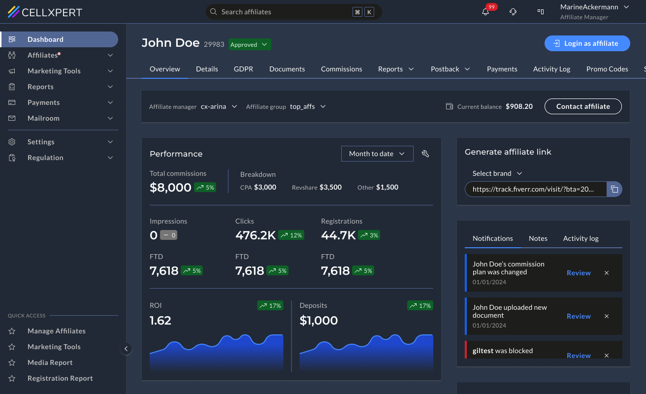
Dashboard.
An overview that actually overviews.
Before
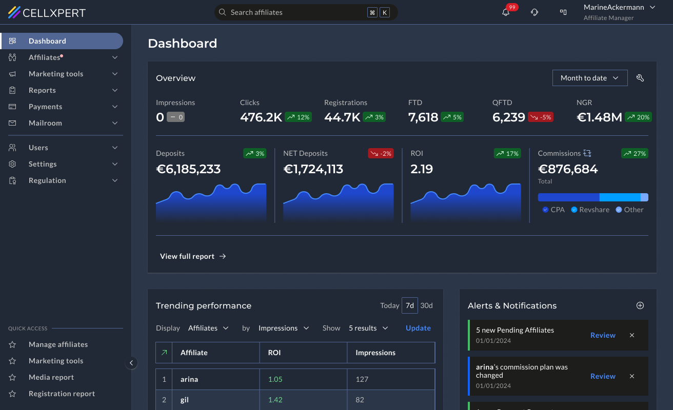
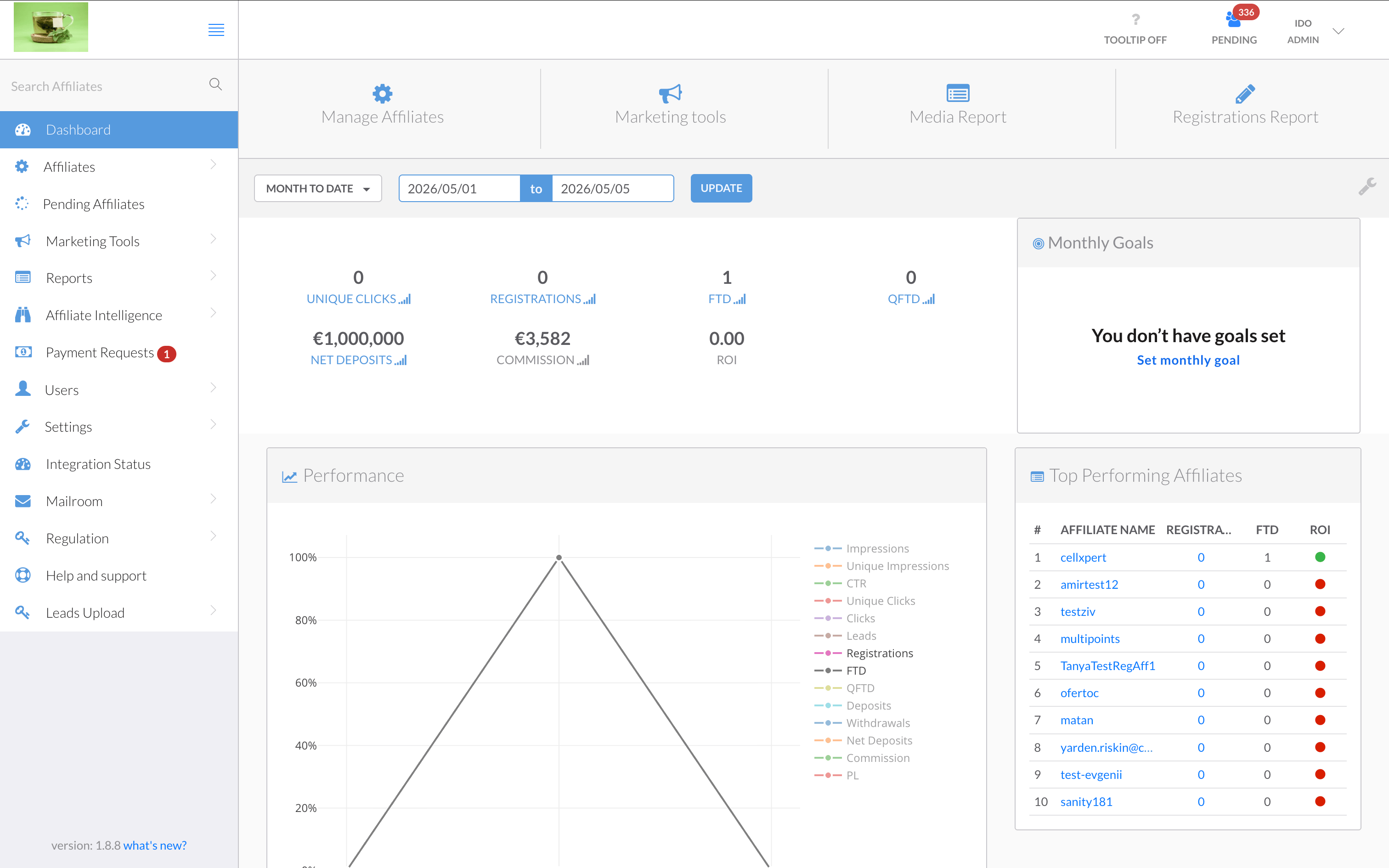
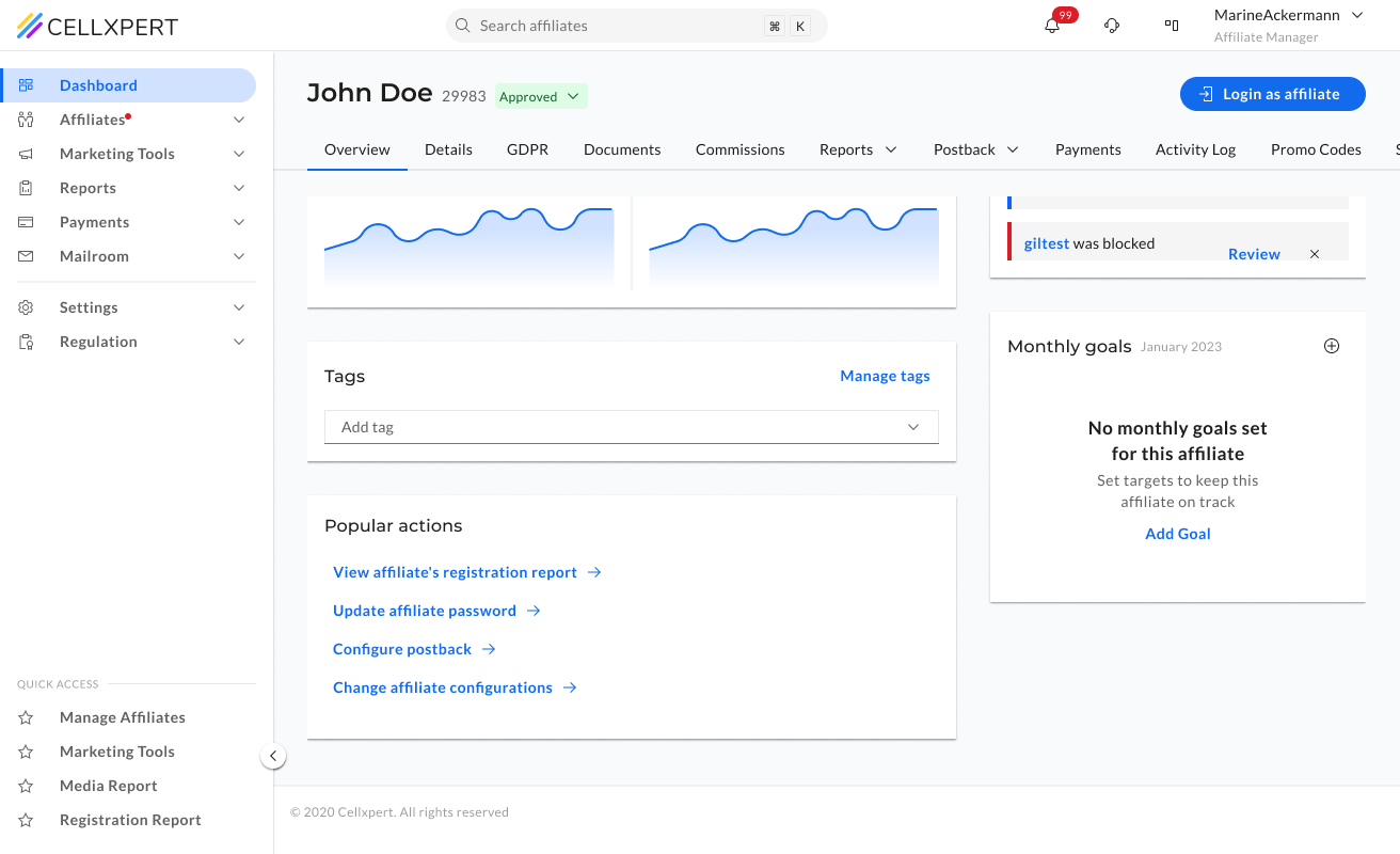
The old dashboard had all the data — but no hierarchy to make sense of it. A single overloaded chart with 10+ competing legend items, a flat metric row with no visual weight, and widgets like "Monthly Goals" sitting empty. Admins couldn't tell what was performing, what needed attention, or what had changed — without significant effort.
What Changed
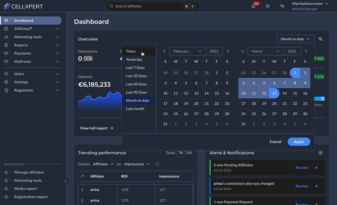
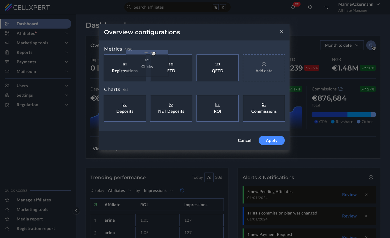
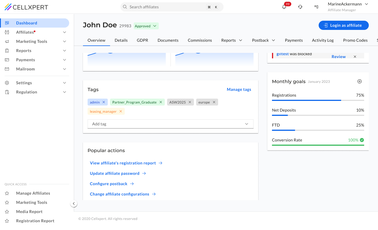
We gave each key metric its own sparkline chart and trend indicator, replaced the noisy performance chart with a focused trending table, and added an Alerts & Notifications panel for actionable signals. Admins can also configure which metrics they want to see — as a number, a chart, or both.
📊
Each metric tells its own story
Instead of one chart holding everything, each KPI gets its own sparkline and trend indicator, so the admin sees direction, not just a number.
⚙️
Configurable by the admin
Admins choose which metrics appear on their dashboard and how — as a number, a chart, or both. The dashboard reflects their priorities, not a fixed template.
🚨
Actionable signals, not just data
The Alerts & Notifications panel surfaces things that need an action: pending affiliates, commission changes - directly on the dashboard.
Feature 02
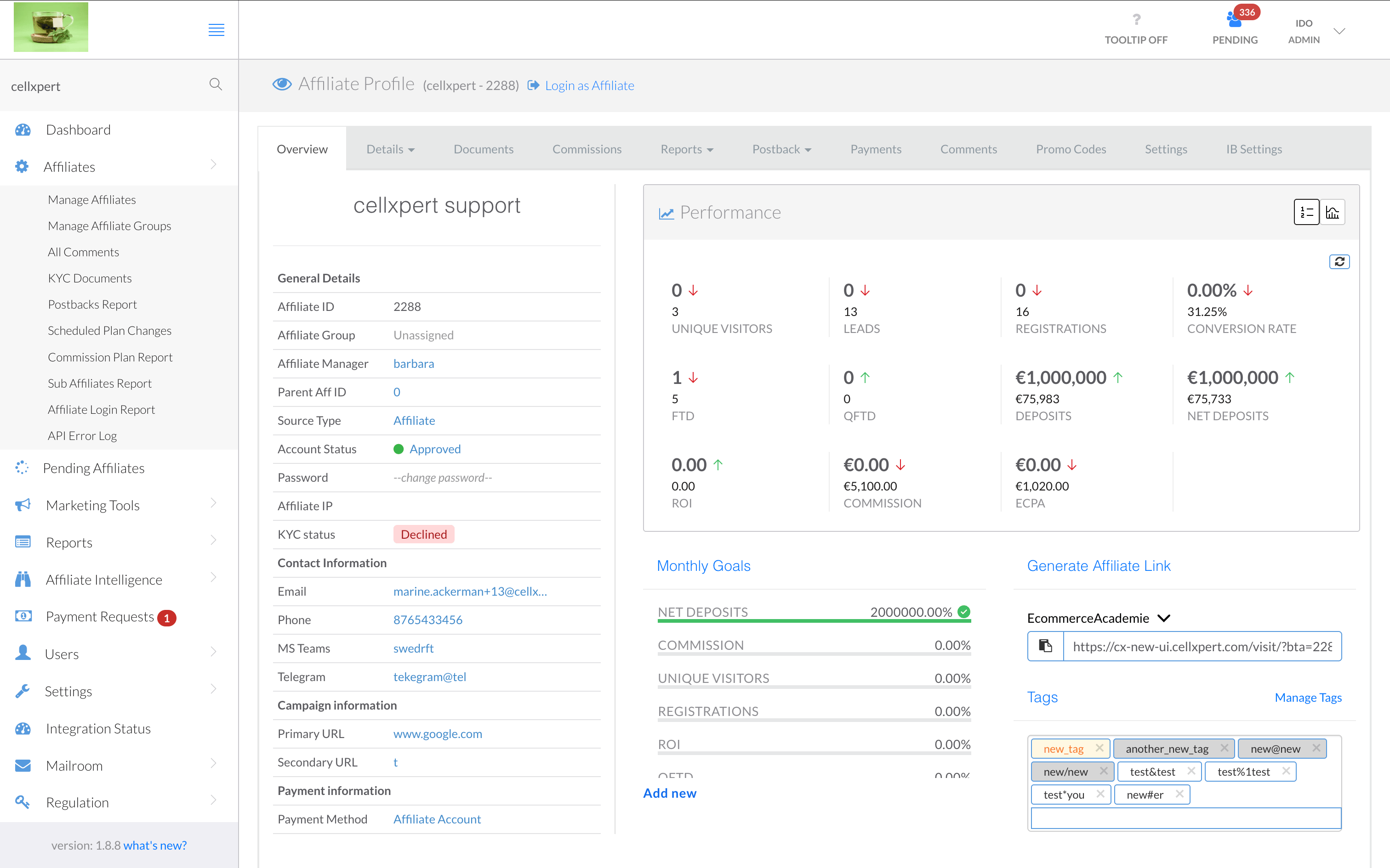
Affiliate Profile.
Know your partner before you act.
Before
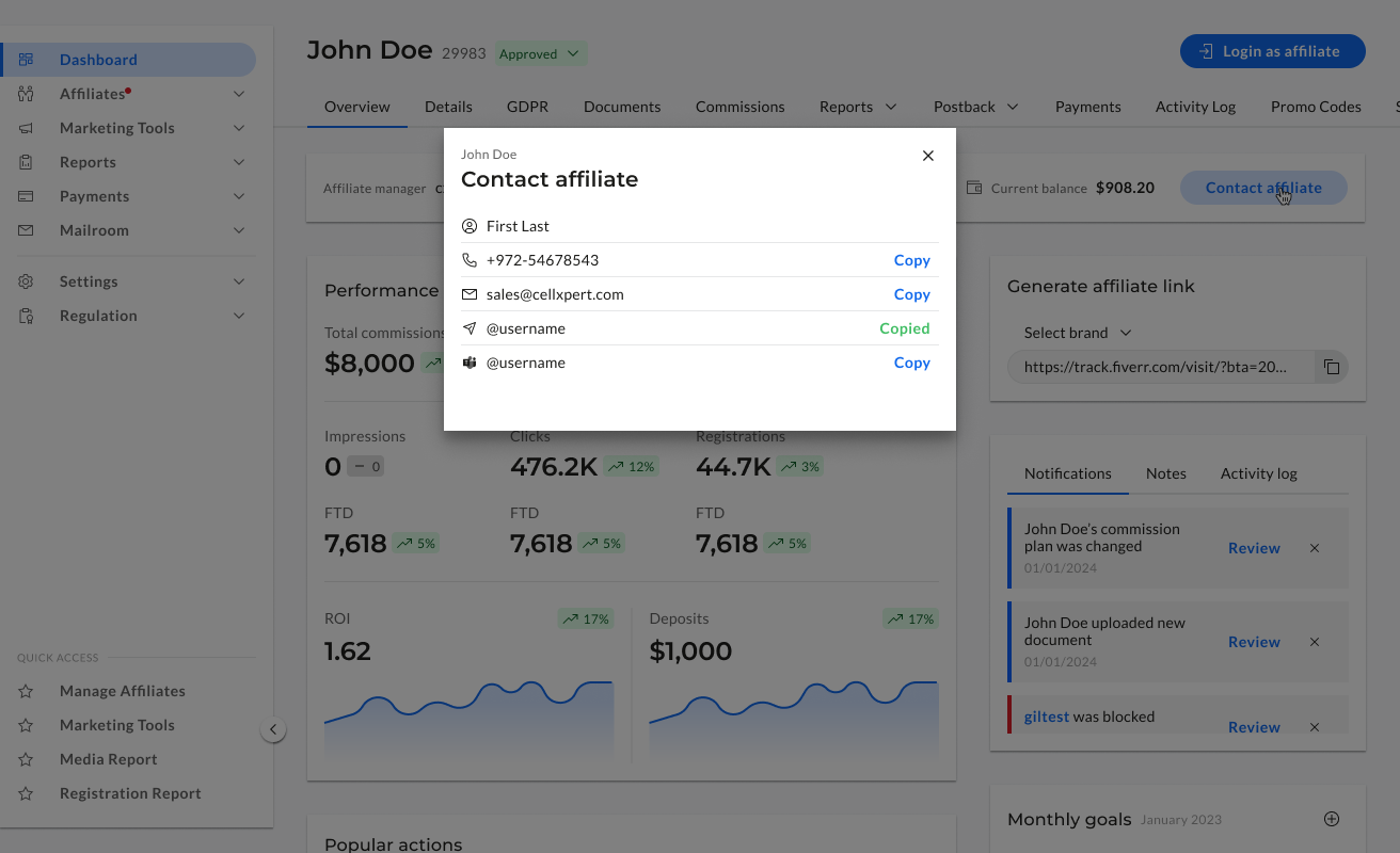
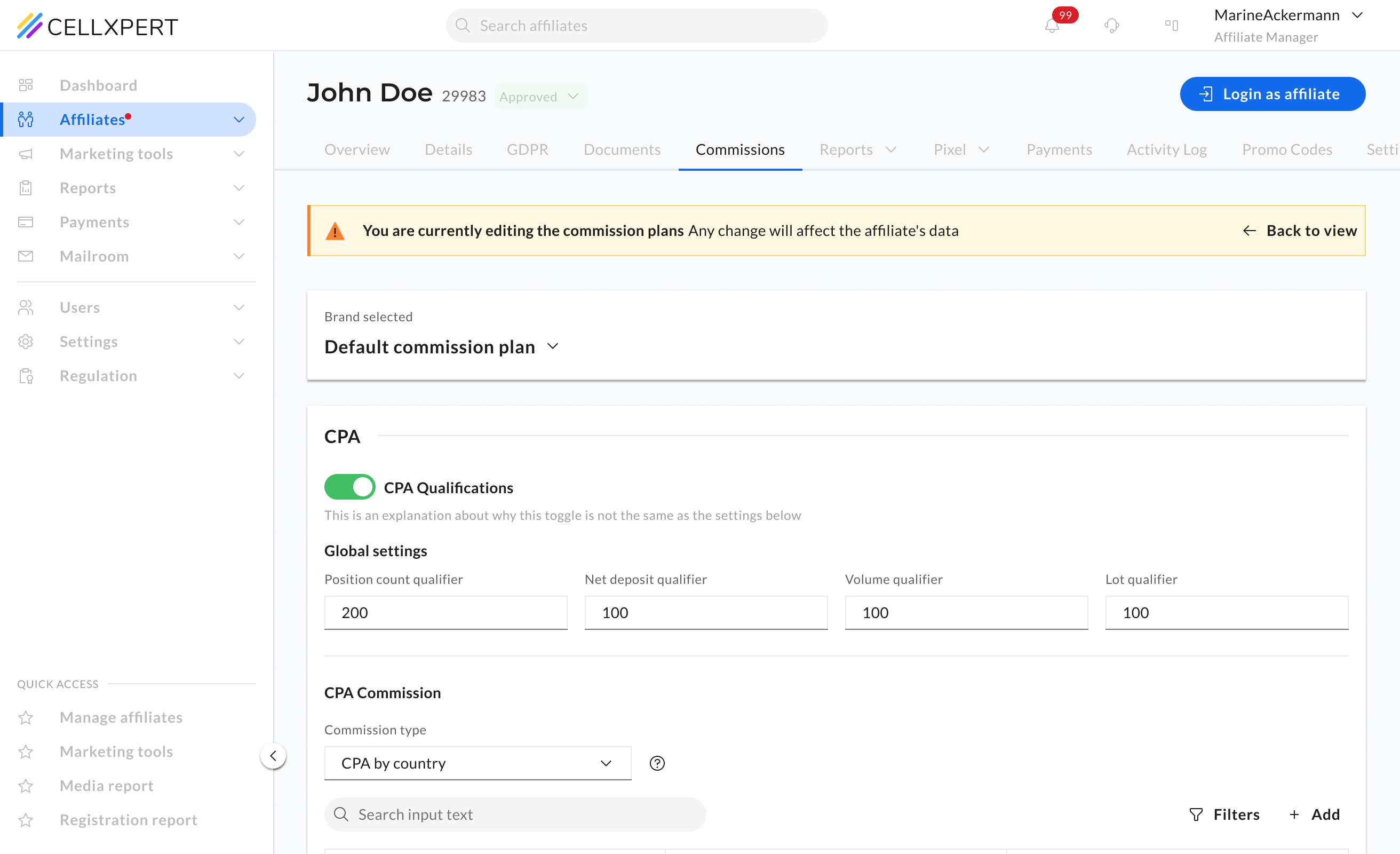
The affiliate profile was the central place for understanding a partner — but it didn't feel that way. Information was scattered with no clear structure, making it difficult to build a complete picture of an affiliate before making decisions about commissions, campaigns, or communications.
What Changed
We restructured the profile around how admins actually think about a partner — who they are, how they're performing, and what's configured for them. Structure first, then detail.
🧠
Structure follows mental model
The layout mirrors how an admin thinks about a partner — identity, then performance, then settings.
🆙
Critical info above the fold
The most-needed details are visible without scrolling — status, key metrics, active plan.
🧼
Less mess, same depth
Nothing was removed — it was organised. The full detail is still there, in the right place.
Feature 03
Marketing Tools.Find what you need. Use it.
Before
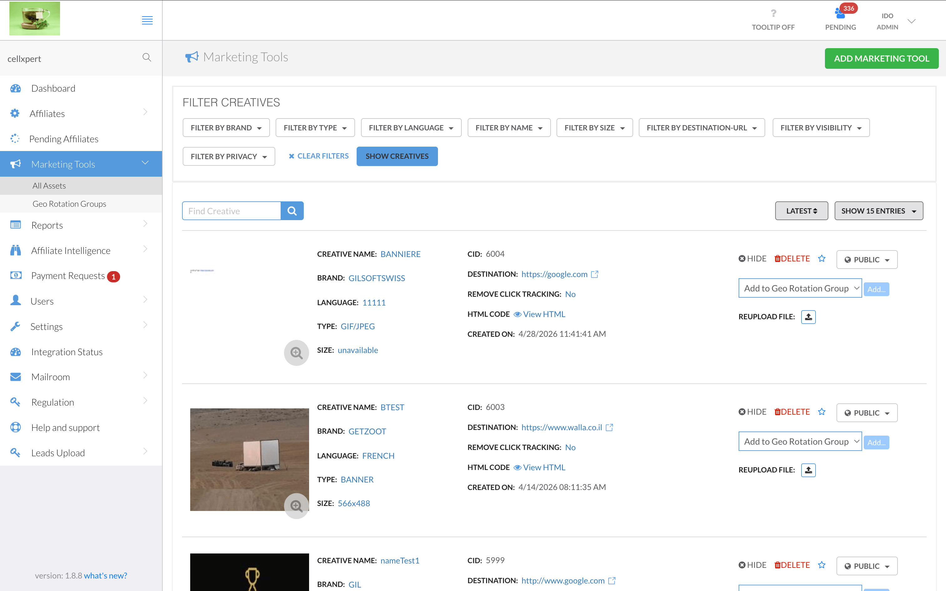
The old marketing tools list was a wall of uppercase labels — every field prefixed with "CREATIVE NAME:", "BRAND:", "LANGUAGE:" in dense rows. Actions like Hide, Delete, or Reupload competed at the same visual level. Seven filter buttons lined the top. Admins couldn't identify an asset at a glance — they had to read every row carefully just to find what they were looking for.
What Changed
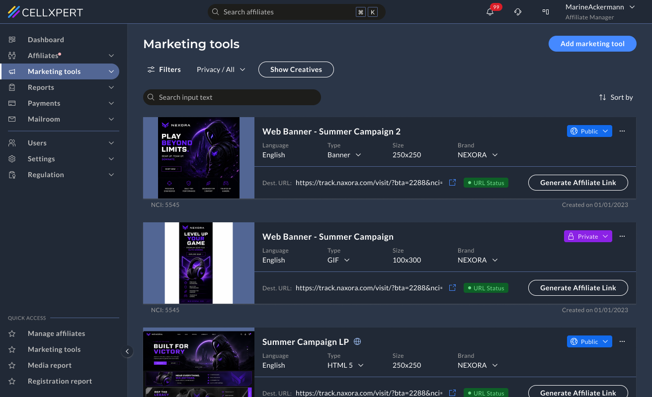
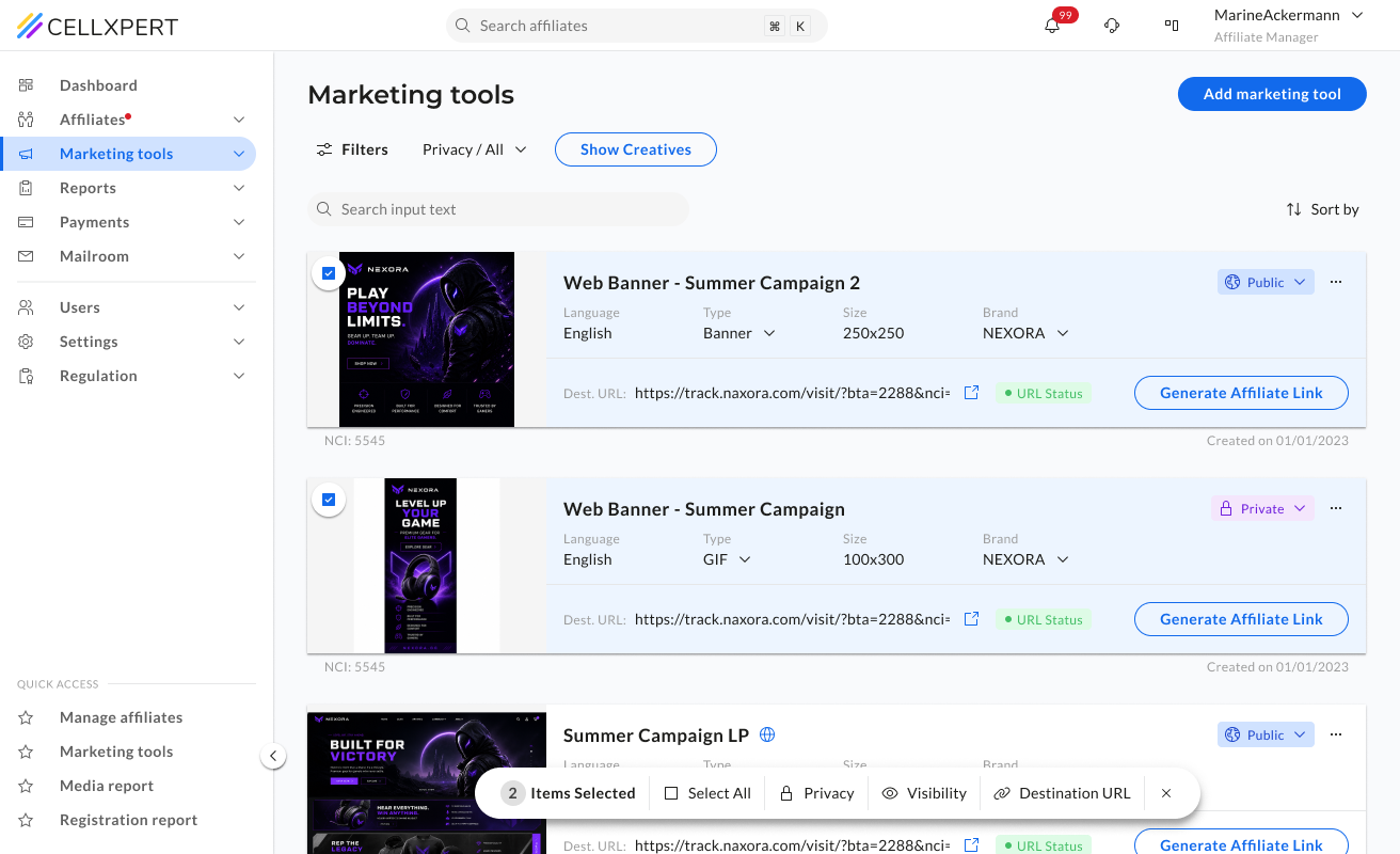
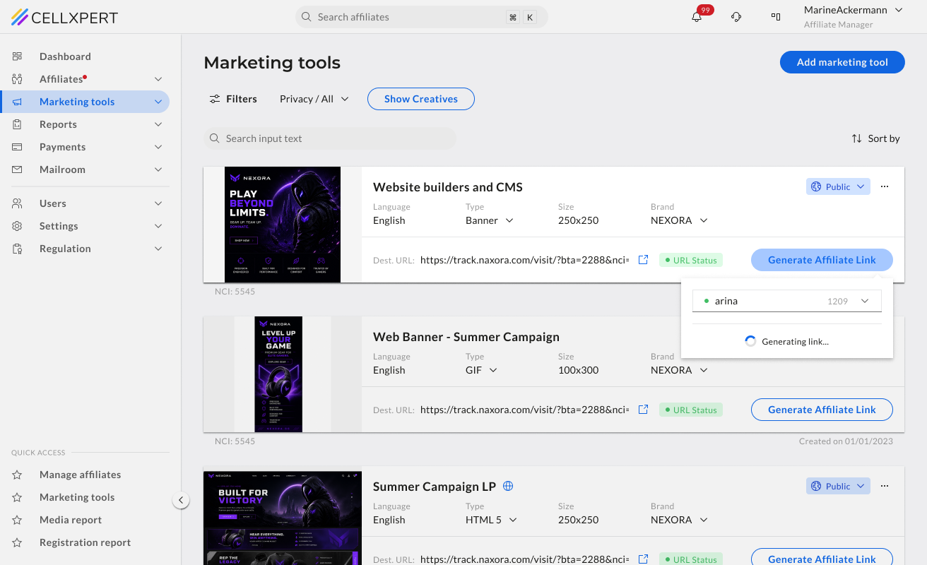
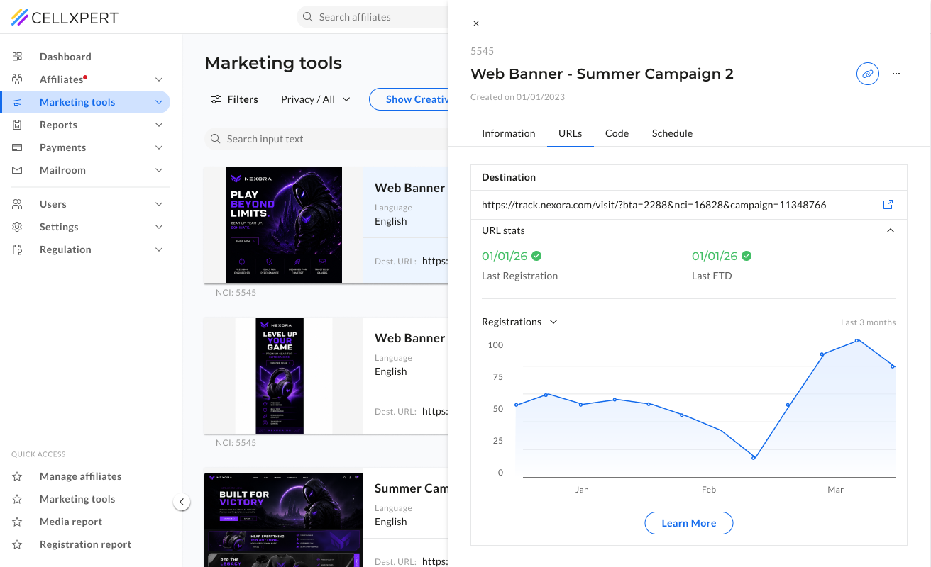
We moved to a card-based layout with the asset preview prominent on the left, metadata in a clean quiet row beneath the name, and the primary action — Generate Affiliate Link — always visible. We added a URL health status indicator per asset, and bulk operations so admins can act on multiple assets at once without opening each one.
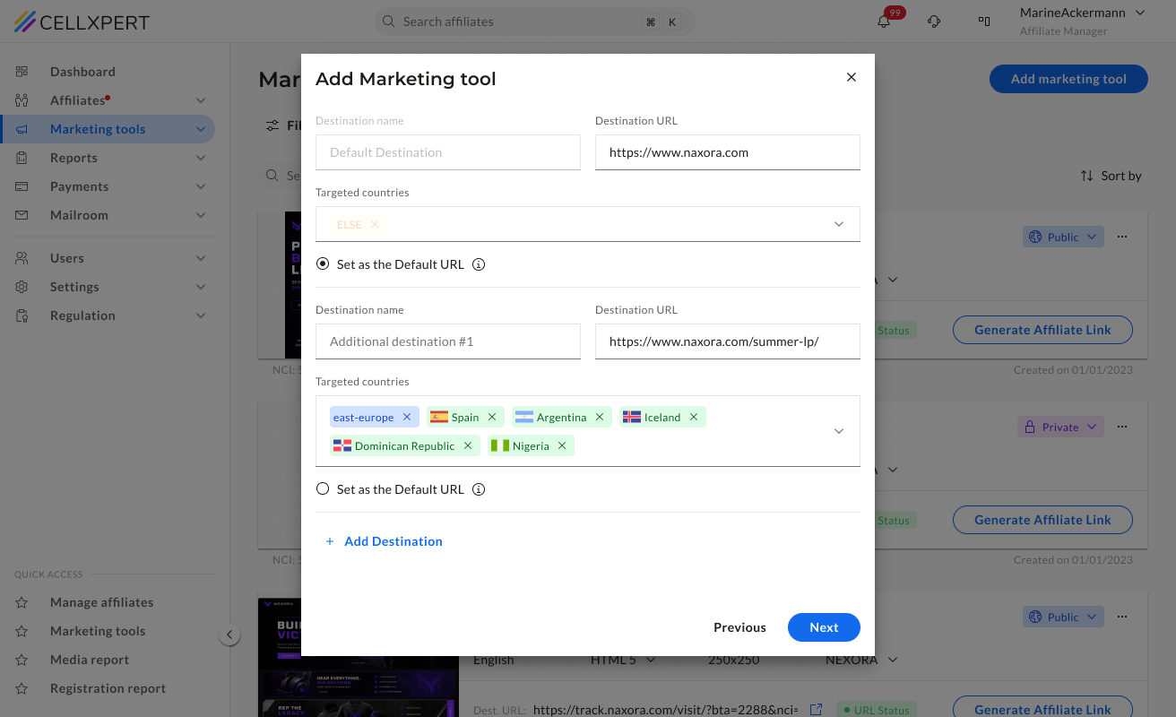
👀
Preview first, metadata second
The asset image leads each card — admins identify what they're looking at visually before reading a single label. Name, type, size, and brand follow in a single quiet row.
🩺
URL health status per asset
A status indicator on each card shows whether the destination URL is healthy — surfacing a problem that previously required clicking into each asset individually to discover.
☑️
Bulk operations
Admins managing large asset libraries can now act on multiple assets at once — hiding, deleting, or updating without opening each one. A significant time save for day-to-day management.
Three different features. The same question answered badly. What am I actually looking at? The redesign made that question easy — across the whole platform.
NEXT PROJECT
Commissions: from messy to trustworthy
The most sensitive feature on the platform redesigned. Split into two focused modes so users can read fast and edit with confidence.
View Case Study

🔶 Admin Side
B2B Web
UI Showcase
Three features.
One shared problem.
Dashboard, Affiliate Profile, and Marketing Tools - each redesigned as part of the full admin side overhaul. Different surfaces, same root cause.
Ido Alony
Feature 01
Dashboard.
An overview that actually overviews.
Before
The old dashboard had all the data — but no hierarchy to make sense of it. A single overloaded chart with 10+ competing legend items, a flat metric row with no visual weight, and widgets like "Monthly Goals" sitting empty. Admins couldn't tell what was performing, what needed attention, or what had changed — without significant effort.
What Changed
We gave each key metric its own sparkline chart and trend indicator, replaced the noisy performance chart with a focused trending table, and added an Alerts & Notifications panel for actionable signals. Admins can also configure which metrics they want to see — as a number, a chart, or both.
📊
Each metric tells its own story
Instead of one chart holding everything, each KPI gets its own sparkline and trend indicator, so the admin sees direction, not just a number.
⚙️
Configurable by the admin
Admins choose which metrics appear on their dashboard and how — as a number, a chart, or both. The dashboard reflects their priorities, not a fixed template.
🚨
Actionable signals, not just data
The Alerts & Notifications panel surfaces things that need an action: pending affiliates, commission changes - directly on the dashboard.
Feature 02
Affiliate Profile.
Know your partner before you act.
Before
The affiliate profile was the central place for understanding a partner — but it didn't feel that way. Information was scattered with no clear structure, making it difficult to build a complete picture of an affiliate before making decisions about commissions, campaigns, or communications.
What Changed
We restructured the profile around how admins actually think about a partner — who they are, how they're performing, and what's configured for them. Structure first, then detail.
🧠
Structure follows mental model
The layout mirrors how an admin thinks about a partner — identity, then performance, then settings.
🆙
Critical info above the fold
The most-needed details are visible without scrolling — status, key metrics, active plan.
🧼
Less mess, same depth
Nothing was removed — it was organised. The full detail is still there, in the right place.
Feature 03
Marketing Tools.Find what you need. Use it.
Before
The old marketing tools list was a wall of uppercase labels — every field prefixed with "CREATIVE NAME:", "BRAND:", "LANGUAGE:" in dense rows. Actions like Hide, Delete, or Reupload competed at the same visual level. Seven filter buttons lined the top. Admins couldn't identify an asset at a glance — they had to read every row carefully just to find what they were looking for.
What Changed
We moved to a card-based layout with the asset preview prominent on the left, metadata in a clean quiet row beneath the name, and the primary action — Generate Affiliate Link — always visible. We added a URL health status indicator per asset, and bulk operations so admins can act on multiple assets at once without opening each one.
👀
Preview first, metadata second
The asset image leads each card — admins identify what they're looking at visually before reading a single label. Name, type, size, and brand follow in a single quiet row.
🩺
URL health status per asset
A status indicator on each card shows whether the destination URL is healthy — surfacing a problem that previously required clicking into each asset individually to discover.
☑️
Bulk operations
Admins managing large asset libraries can now act on multiple assets at once — hiding, deleting, or updating without opening each one. A significant time save for day-to-day management.
Three different features. The same question answered badly. What am I actually looking at? The redesign made that question easy — across the whole platform.
NEXT PROJECT
Commissions: from messy to trustworthy
The most sensitive feature on the platform redesigned. Split into two focused modes so users can read fast and edit with confidence.
View Case Study
🔶 Admin Side
B2B Web
UI Showcase
Three features.
One shared problem.
Dashboard, Affiliate Profile, and Marketing Tools - each redesigned as part of the full admin side overhaul. Different surfaces, same root cause.
Feature 01
Dashboard.
An overview that actually overviews.
Before
The old dashboard had all the data — but no hierarchy to make sense of it. A single overloaded chart with 10+ competing legend items, a flat metric row with no visual weight, and widgets like "Monthly Goals" sitting empty. Admins couldn't tell what was performing, what needed attention, or what had changed — without significant effort.
What Changed
We gave each key metric its own sparkline chart and trend indicator, replaced the noisy performance chart with a focused trending table, and added an Alerts & Notifications panel for actionable signals. Admins can also configure which metrics they want to see — as a number, a chart, or both.
📊
Each metric tells its own story
Instead of one chart holding everything, each KPI gets its own sparkline and trend indicator, so the admin sees direction, not just a number.
⚙️
Configurable by the admin
Admins choose which metrics appear on their dashboard and how — as a number, a chart, or both. The dashboard reflects their priorities, not a fixed template.
🚨
Actionable signals, not just data
The Alerts & Notifications panel surfaces things that need an action: pending affiliates, commission changes - directly on the dashboard.
Feature 02
Affiliate Profile.
Know your partner before you act.
Before
The affiliate profile was the central place for understanding a partner — but it didn't feel that way. Information was scattered with no clear structure, making it difficult to build a complete picture of an affiliate before making decisions about commissions, campaigns, or communications.
What Changed
We restructured the profile around how admins actually think about a partner — who they are, how they're performing, and what's configured for them. Structure first, then detail.
🧠
Structure follows mental model
The layout mirrors how an admin thinks about a partner — identity, then performance, then settings.
🆙
Critical info above the fold
The most-needed details are visible without scrolling — status, key metrics, active plan.
🧼
Less mess, same depth
Nothing was removed — it was organised. The full detail is still there, in the right place.
Feature 03
Marketing Tools.Find what you need. Use it.
Before
The old marketing tools list was a wall of uppercase labels — every field prefixed with "CREATIVE NAME:", "BRAND:", "LANGUAGE:" in dense rows. Actions like Hide, Delete, or Reupload competed at the same visual level. Seven filter buttons lined the top. Admins couldn't identify an asset at a glance — they had to read every row carefully just to find what they were looking for.
What Changed
We moved to a card-based layout with the asset preview prominent on the left, metadata in a clean quiet row beneath the name, and the primary action — Generate Affiliate Link — always visible. We added a URL health status indicator per asset, and bulk operations so admins can act on multiple assets at once without opening each one.
👀
Preview first, metadata second
The asset image leads each card — admins identify what they're looking at visually before reading a single label. Name, type, size, and brand follow in a single quiet row.
🩺
URL health status per asset
A status indicator on each card shows whether the destination URL is healthy — surfacing a problem that previously required clicking into each asset individually to discover.
☑️
Bulk operations
Admins managing large asset libraries can now act on multiple assets at once — hiding, deleting, or updating without opening each one. A significant time save for day-to-day management.
Three different features. The same question answered badly. What am I actually looking at? The redesign made that question easy — across the whole platform.
NEXT PROJECT
Commissions: from messy to trustworthy
The most sensitive feature on the platform redesigned. Split into two focused modes so users can read fast and edit with confidence.
View Case Study