🔶 Admin Side
B2B Web
Feature Redesign
The feature where
every change costs money.
Redesigning the commission builder - the most sensitive, most critical, and most broken feature on the platform.
Ido Alony
Projects

About

Resume

Who uses this
The affiliate manager.
This is their most careful task.
Affiliate managers are the clients operating the Cellxpert platform on behalf of their business. Their job is to manage partner relationships, and at the center of every relationship is a commission plan. Getting it wrong has direct financial consequences. For the partner, for the business, and for trust on both sides.

"When a partner asks about their commission, I need the answer quickly."
WHO THEY ARE
B2B operators managing anywhere from 10 to thousands of affiliate partners
Their relationship with commissions
Frequent readers, occasional editors. They check plans constantly, change them carefully.
What confidence looks like
Knowing exactly what a partner is on, what brands it applies to, and who last changed it, before touching anything
Research
What we learned
before we designed anything.
We didn't start with wireframes. We started with complaints- real ones, from the people using the system every day. Three sources shaped everything that came after.
🎫
Support tickets
A recurring category of tickets around commission clarity, admins confused about what plan was active, what was enabled per brand, and whether changes had taken effect.
💬
Stakeholder input
Internal stakeholders flagged the commission section as the most error-prone area of the platform — and the one most likely to require manual correction after user mistakes.
👀
Direct observation
Watching admins work with the old UI revealed a consistent pattern: users would open the commissions section, look around, and leave without making changes they had intended to make.
01
Admins couldn't see the full picture
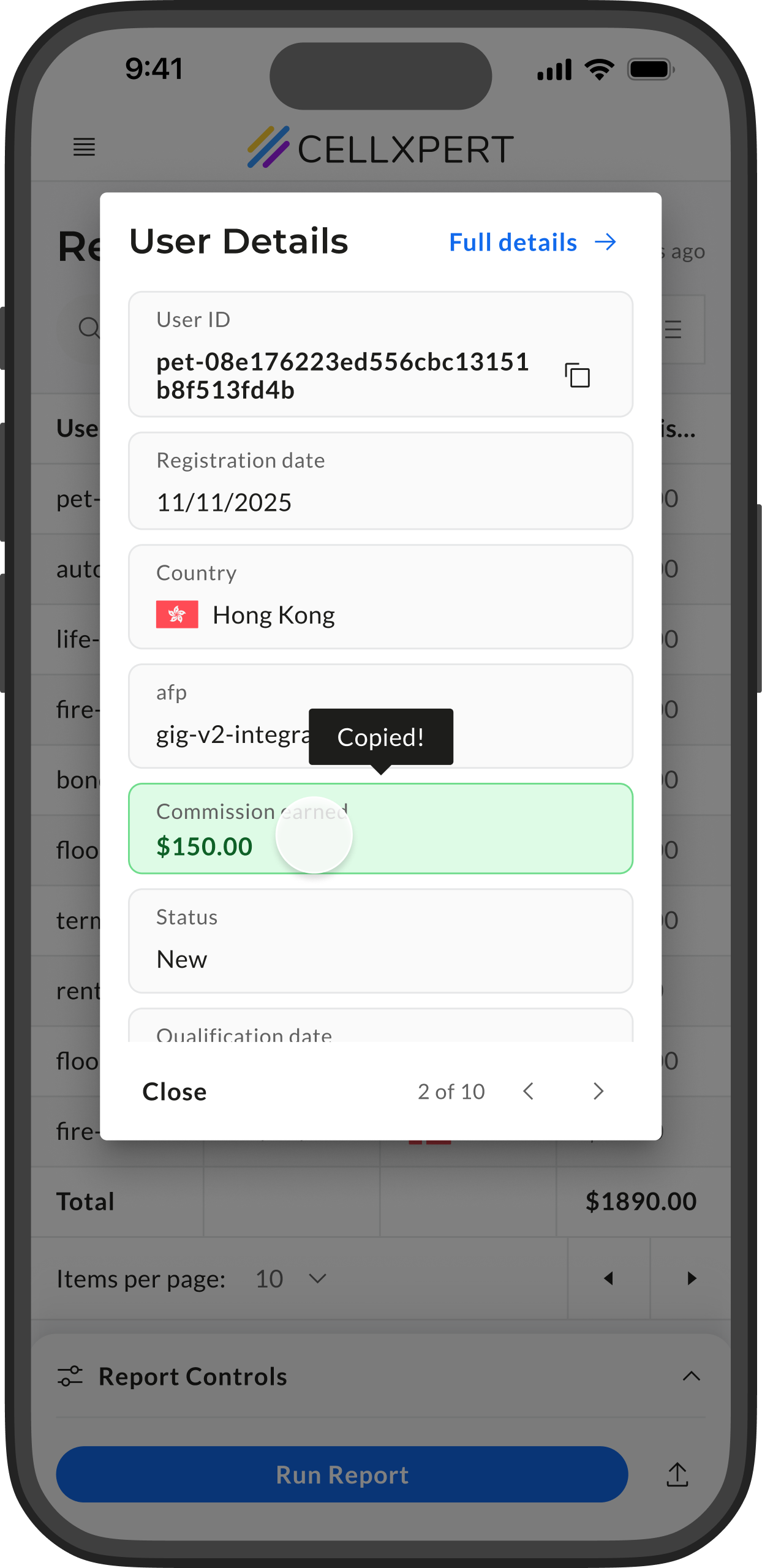
All commission plan types lived on the same screen, navigated via slides. Switching between plan types meant losing context on the others. There was no way to see the complete commission structure for an affiliate in one view.
“I can never tell what they're actually on without clicking through everything”
02
Brand switching made it impossible to compare
A dropdown selected the active brand — and changing it replaced the entire screen. Admins managing multiple brands for one affiliate had no way to see both at once. This caused frequent confusion about what was active for which brand.
“I have to keep switching back and forth just to remember what the other brand had”
03
Everything looked editable, all the time
The old UI presented fields and controls regardless of whether the admin intended to edit anything. This created ambient anxiety — users worried that accidental interactions might change something important without clear feedback.
“I'm never sure if I accidentally changed something when I was just trying to look”
04
The primary job wasn't editing — it was reading
The most common reason admins opened the commissions section was simply to check what was there — before a partner call, before a report, before a decision. The old system was designed entirely for editing, and did the reading job poorly.
Most of the time I just need to see the plan — I'm not changing anything
The constraint we worked within
The backend had to stay as close to the same as possible.
Stakeholders were clear: the data model and backend logic that powered commissions couldn't be rebuilt from scratch. We needed to make meaningful UX improvements while keeping the underlying system largely intact. This wasn't a limitation — it was a creative constraint that sharpened our focus.
What this meant for design
We couldn't change what data existed or how it was stored. We could only change how it was presented, structured, and interacted with. The solution had to be entirely in the interface layer — which is exactly where the problems were.
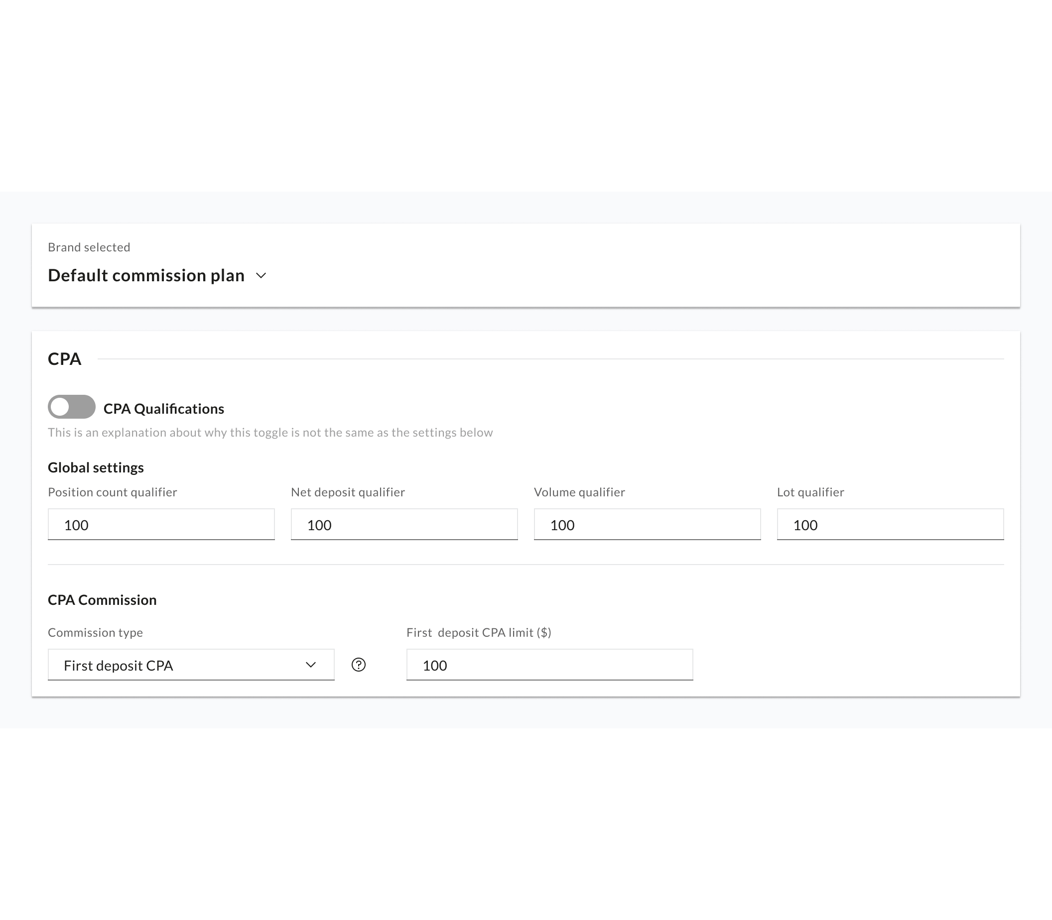
BEFORE
What it looked like.
What it felt like.
The old commissions UI wasn't broken in one obvious way. It was the accumulation of small structural decisions that made comprehension genuinely difficult — especially under the pressure of a real work context.
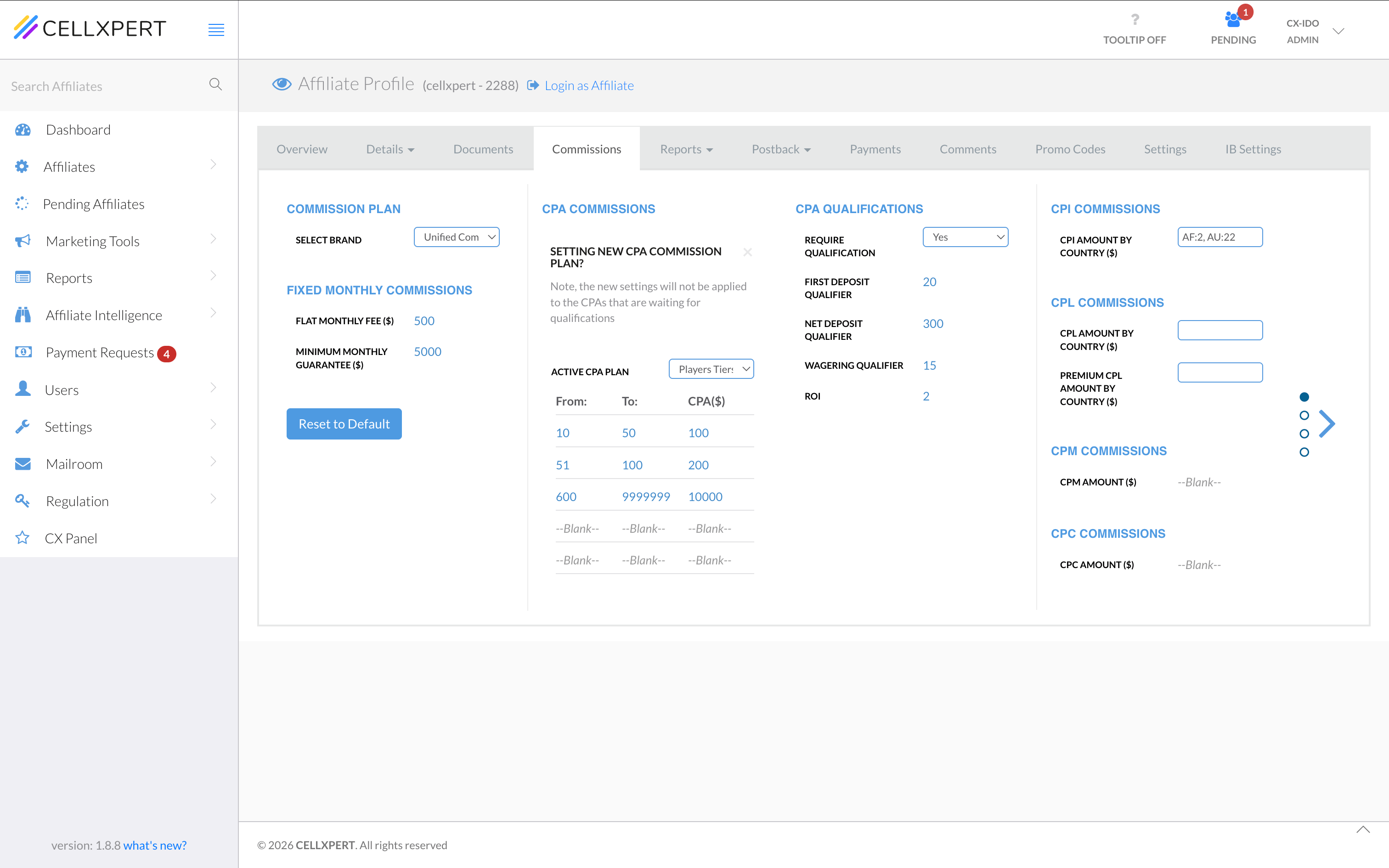
1
Slide-based plan navigation
Switching between commission types (CPA, Revshare, etc.) required navigating slides — meaning you could only see one type at a time, with no overview of the full plan.
2
Brand dropdown replaces the screen
Selecting a different brand swapped out the entire view. Comparing two brands required memory, not UI — and led to frequent errors and confusion.
3
Always in edit mode
Fields were always editable. There was no visual distinction between reading a plan and editing one — creating a persistent sense of risk for every interaction.
The insight that drove everything
The system was designed for editing.The job was understanding.
Everything the research pointed to had the same root cause: the old UI assumed that the reason someone opened commissions was to change something. But the data told a different story. The most common reason was simply to check what was there. To verify, to understand, to prepare. We were designing for the wrong moment.
The insight that drove everything
Admins open commissions to edit
The entire UI was built around configuration — fields, dropdowns, and controls always visible, always ready. Reading was an afterthought.
The real job
Admins open commissions to understand
The primary use case was reading and verification — checking what a partner was on before a call, a report, or a decision. Editing was secondary.
The Solution
Two modes.Two jobs done properly.
The insight led directly to the decision: split the commissions feature into two distinct modes — each designed for the mental state it serves. View mode for comprehension. Configuration mode for precision. No compromise on either side.
Mode 01 — Default state
View mode.Read it in seconds.
The default state of the commissions tab. Designed entirely for comprehension. Every structural decision serves one goal: let the admin understand the full commission plan immediately, without friction or risk.
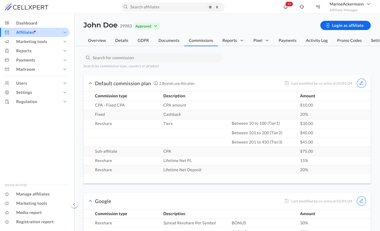
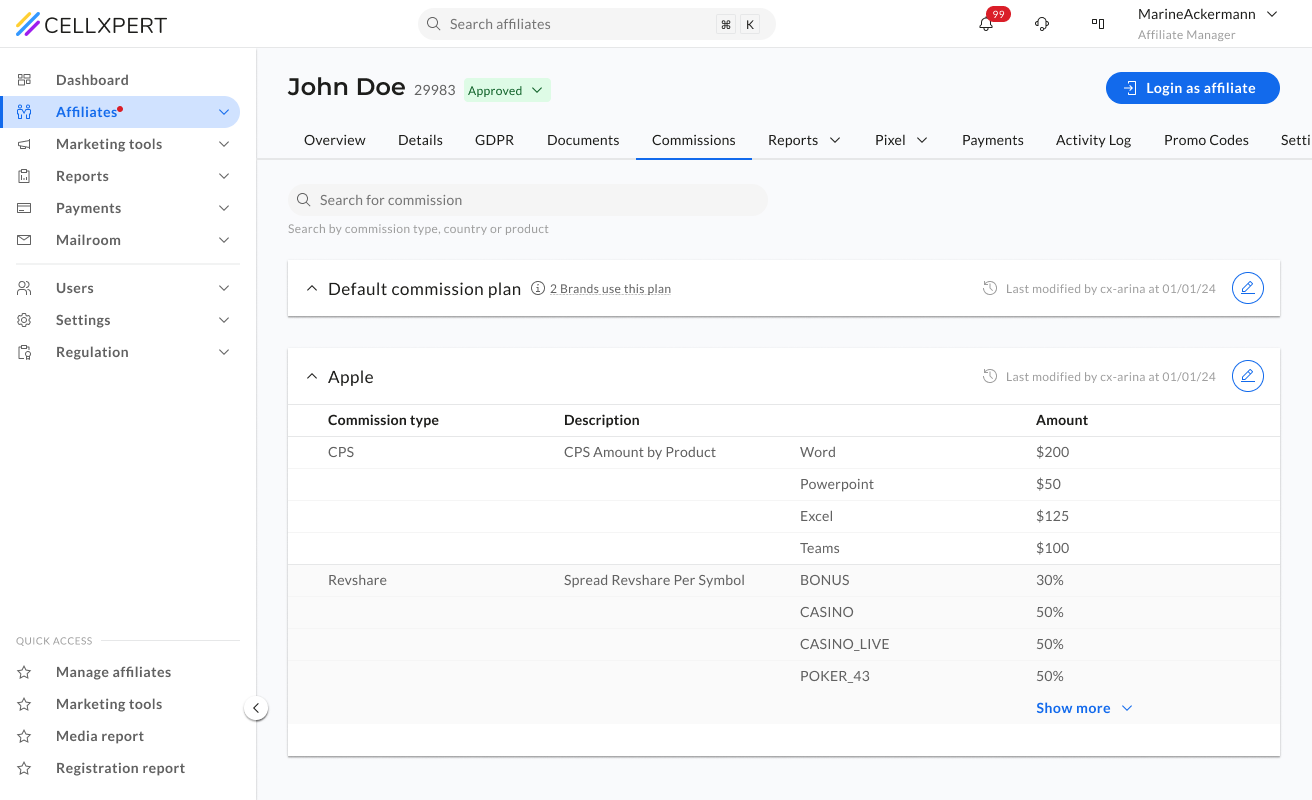
Accordion by brand
Each brand the affiliate is enabled for gets its own collapsible section. Admins can see all brands at once, or focus on one — without the screen replacing itself.
Why → Directly solves the "I can't see both brands at the same time" problem from research.
Table: type, description, amount
Commission components are presented in a clean three-column table — scannable in seconds, with tiers rendered as sub-rows beneath their parent plan type.
Why → Replaces the slide-by-slide navigation with a single, comprehensive view of the full plan.
Metadata that builds confidence
"Last modified by [user] at [date]" and "X brands use this plan" give the admin the history and weight of a plan before they interact with it.
Why → Answers the question "did someone change this?" before it becomes a support ticket.
Search across all plans
A search bar filters by commission type, country, or product across all brands simultaneously — without navigating or switching views.
Why → For admins managing complex multi-brand plans, this cuts a multi-step task to a single query.
Read-only by default
Nothing is editable in view mode. No fields, no dropdowns, no toggles — just the data. The visual calm communicates that browsing here is safe.
Why → Removes the ambient anxiety of "did I accidentally change something."
Edit lives behind a clear action
A single edit icon per accordion section is the only entry point to configuration. It's visible but not prominent — present when needed, quiet when not.
Why → The path to editing is deliberate — you have to mean it.
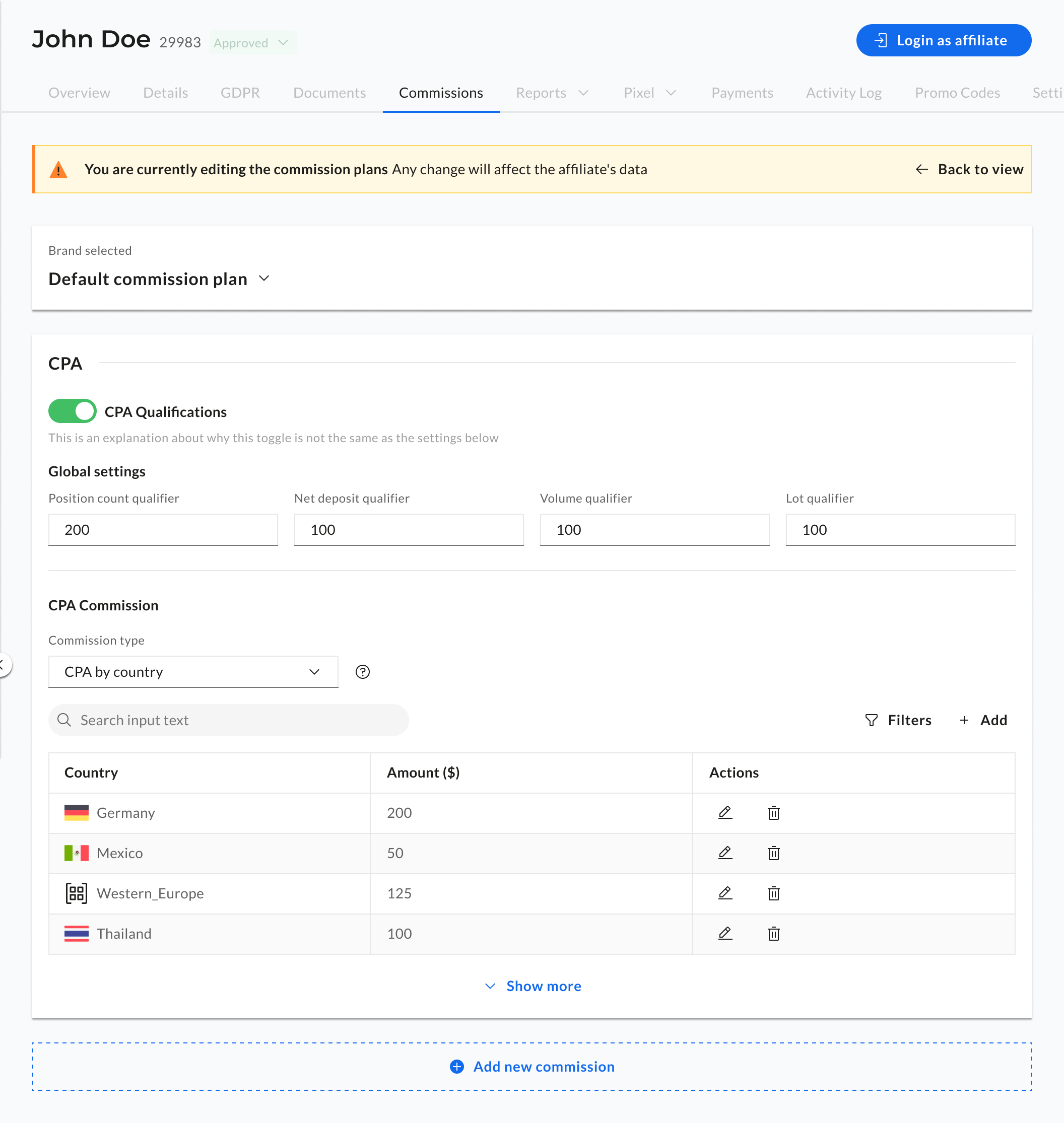
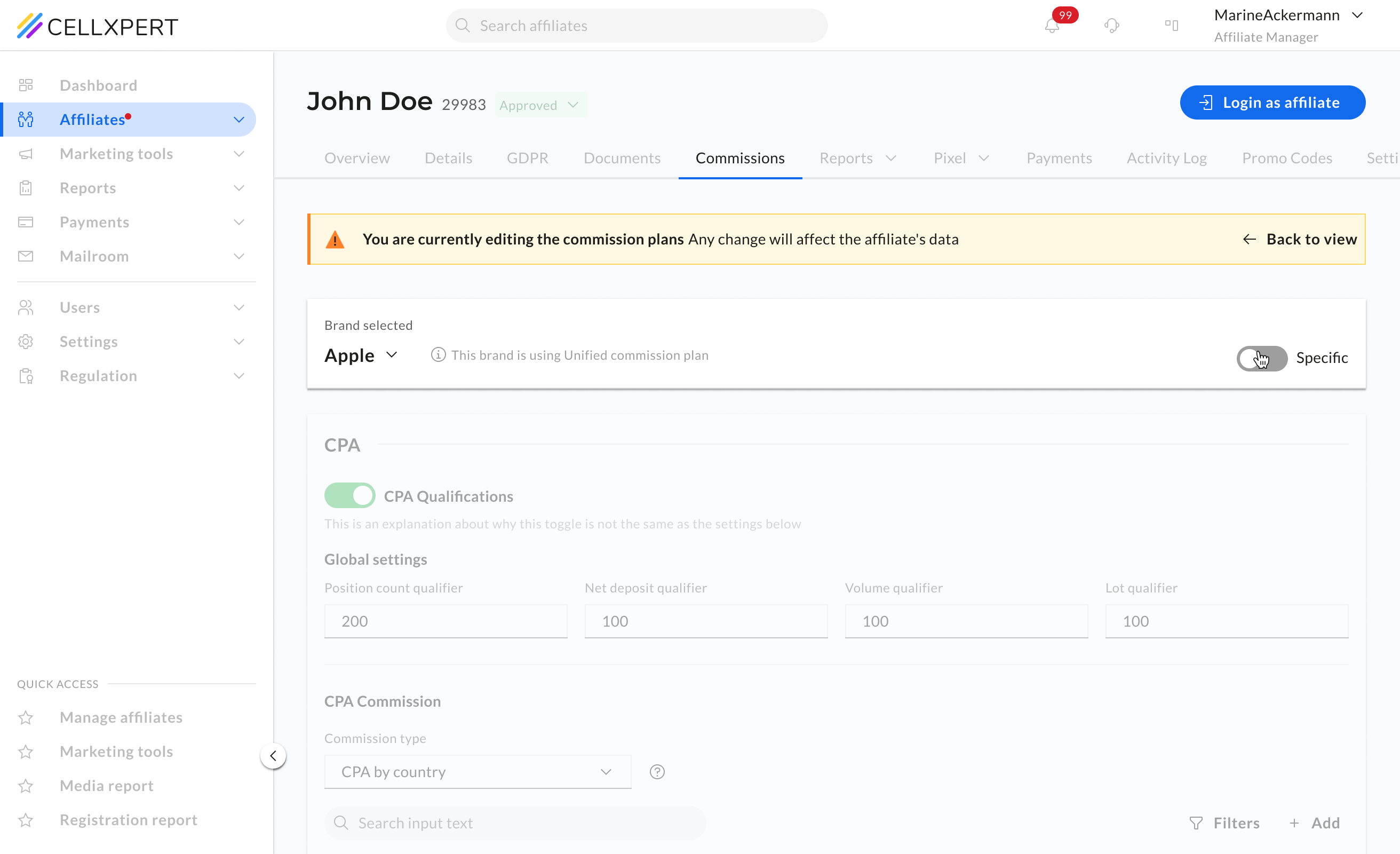
Mode 02 — Edit state
Configuration mode.You're here on purpose.
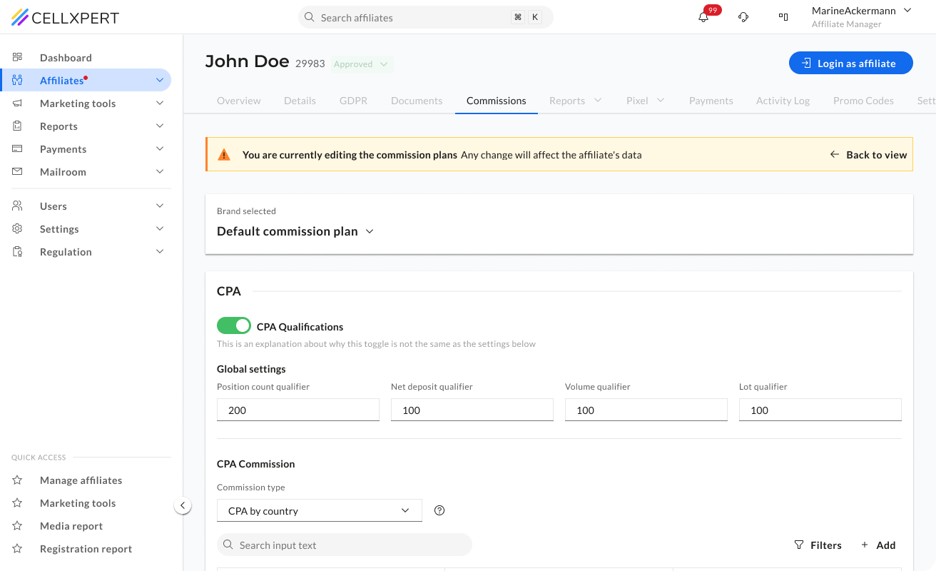
Triggered by a deliberate click. Everything outside the commission tab steps back. The interface narrows its focus to signal: what you do here has real consequences, and we've made it as clear as possible.
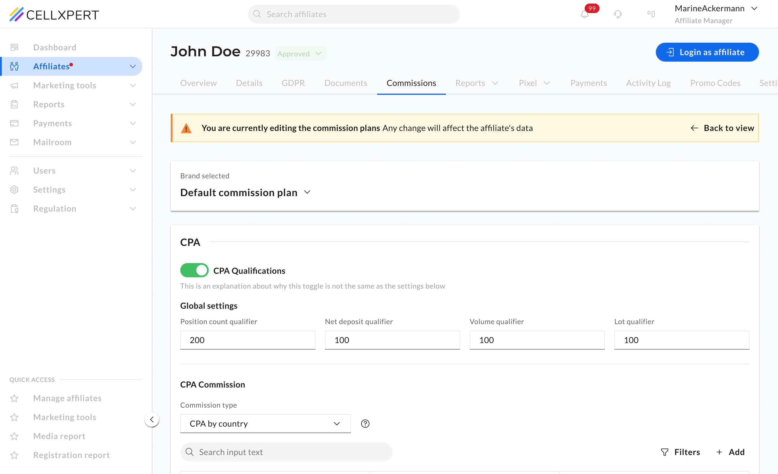
Everything else is disabled
On entering configuration mode, all tabs, navigation, and UI outside the commission section become inactive. The admin's entire focus narrows to the task at hand.
Why → Focus is a form of safety in high-stakes interactions.
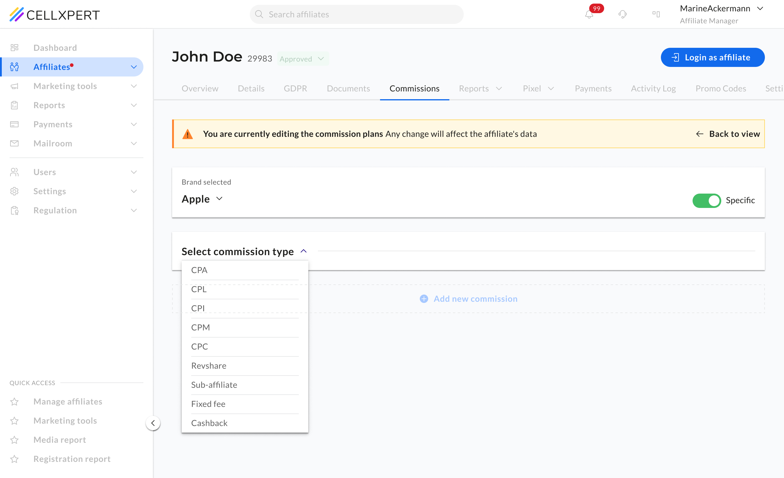
The persistent warning banner
"You are currently editing commission plans. Any change will affect the affiliate's data." Visible throughout the entire session, a constant reminder of what's at stake.
Why → Stakes made visible cannot be forgotten. The banner isn't alarming — it's grounding.
Changes apply instantly
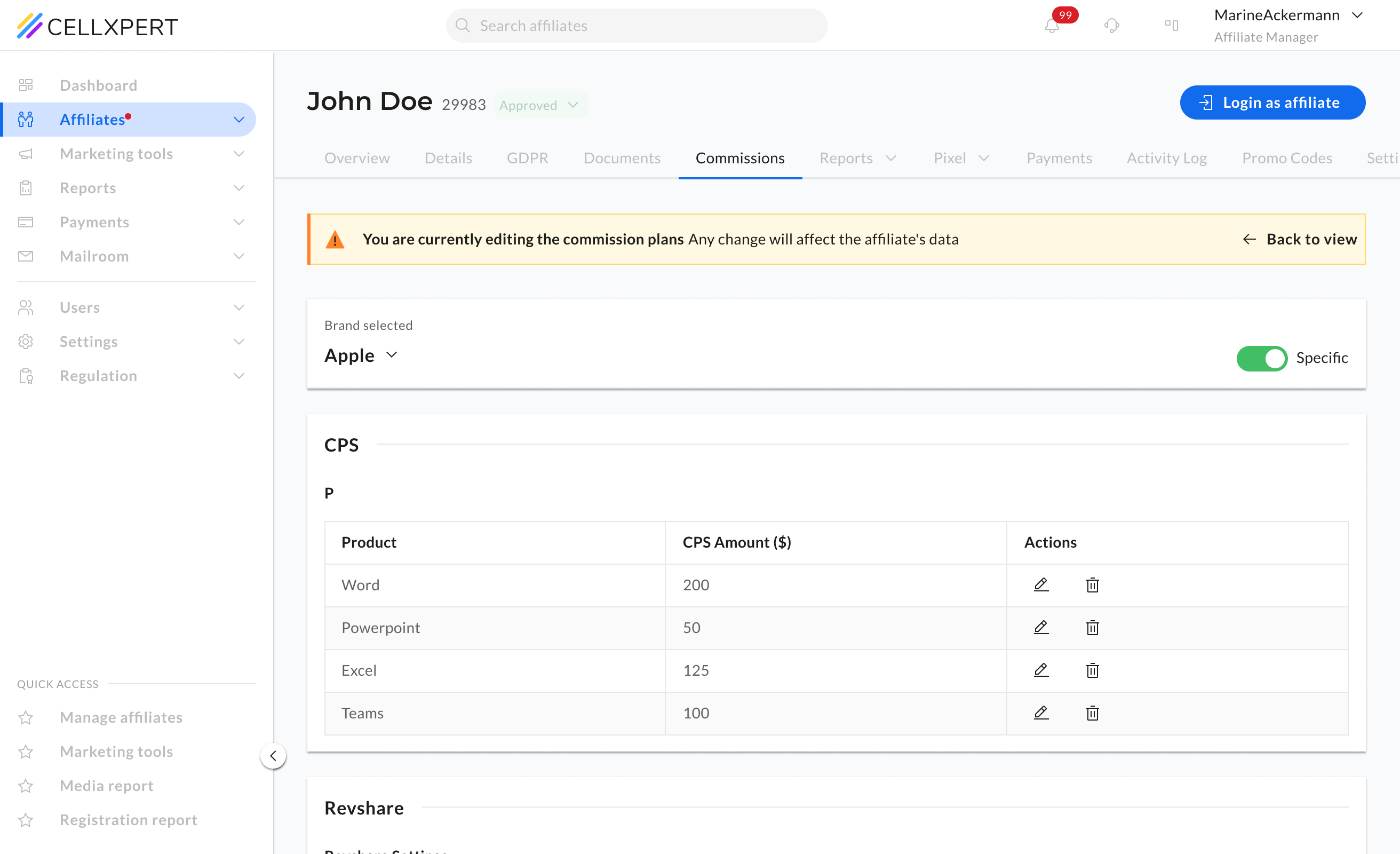
Due to backend constraints, there's no global save button. Changes apply on the spot — and every change triggers an immediate inline notification confirming what happened.
Why → The absence of a save button could create anxiety. The notification replaces it with something better: certainty.
The hidden complexity
One configuration UI.40+ commission types.
The platform supports over 40 distinct commission plan types — Fixed CPA, Revshare, tiered structures, hybrid plans, country-based variations, symbol-based plans, sub-affiliate commissions, and more. Each type has its own fields, its own logic, and its own edge cases.
The configuration mode had to accommodate all of them within a single, coherent UI, without creating a bespoke layout for every type, and without overwhelming the admin with options they don't need for the plan they're building. The solution was a dynamic form that adapts its fields based on the selected commission type- showing only what's relevant, when it's relevant.
In practice
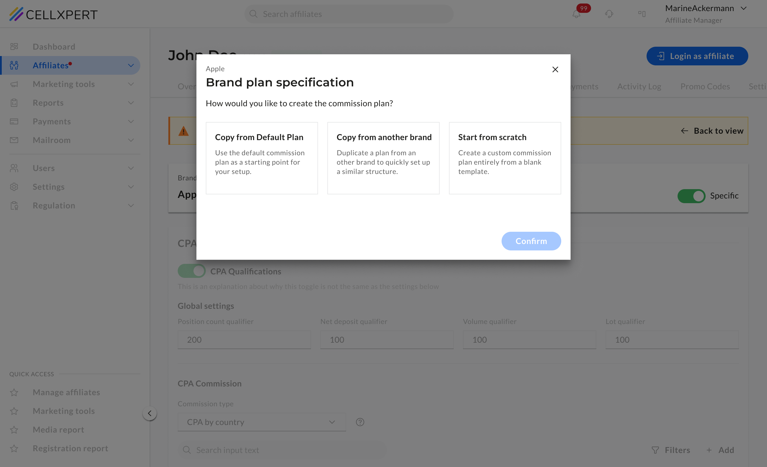
The flow in action.Setting up a brand-specific plan.
One of the most meaningful actions an admin can take in the commission system — breaking a brand away from the default plan and setting something specific. It starts with a single decision modal and branches into three distinct paths depending on the admin's intent.
Below is the start from scratch path — the most complex of the three, and the one that best demonstrates how the configuration UI handles the full range of plan types.
01
The starting point
The brand is using the default commission plan. The admin is in configuration mode and decides this brand needs its own specific plan, not the shared default.
02
One modal. Three intents.
A single modal presents three paths: copy from the default plan, copy from another brand, or start from scratch. The admin picks based on how much of the work is already done.
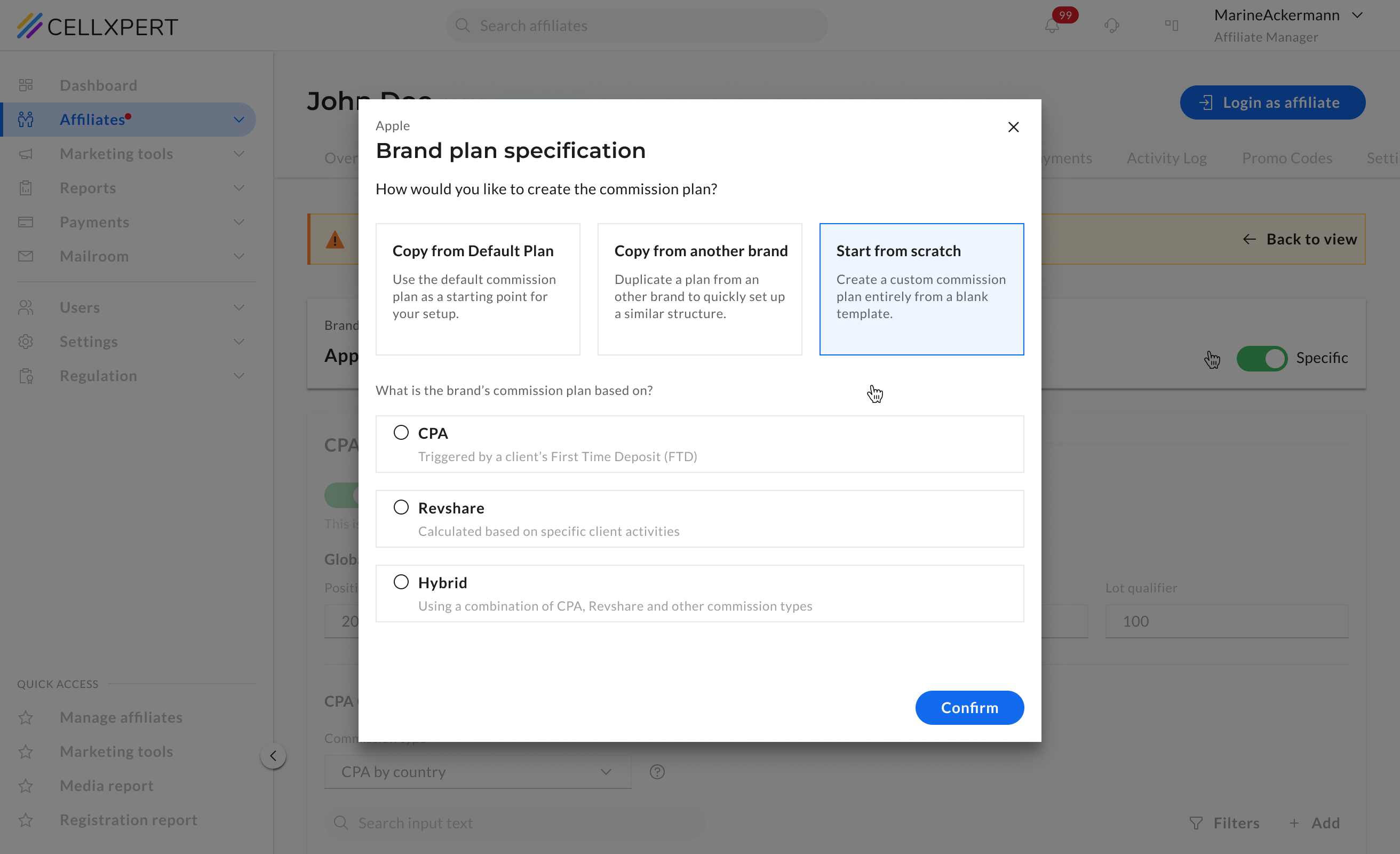
03
Start from scratch
"Start from scratch" is selected. The admin now chooses the base commission type: CPA, Revshare, or hybrid. This is where the branching into 35+ plan types begins.
04
An empty plan, ready to build
The configuration form opens with the relevant fields for the selected type. The warning banner is visible - the admin knows they're working live. They start filling in values.
05
The plan is fully configured
All commission components are set — amounts, types, tiers. The plan is complete and has been applied in real time as each field was confirmed.
06
Back to view. Plan confirmed.
The admin exits configuration mode. The brand now shows its own specific commission plan in the view mode table - clearly separated from the default, structured and readable at a glance.
Results
Tested before it
shipped.

The commissions redesign is pre-release at the time of writing. These findings are based on structured sessions with internal teams, QA, and a select group of existing users.
Admins understood the full commission plan structure immediately, without guidance
In testing, users navigated the accordion and table structure without instruction. The reading experience was described as "finally clear."
User testing — view mode sessions
Zero confusion about which mode they were in
Every tester understood the view/config distinction from the first session. The mode shift — disabled context, warning banner — communicated the change without explanation.
Internal QA & user sessions
The warning banner was described as reassuring, not alarming
Rather than creating anxiety, testers reported the banner made them feel more confident — they knew exactly what they were doing and what it meant.
User testing feedback
The commissions redesign didn't solve a visual problem. It solved a confidence problem, and that turned out to be the same thing as solving the business problem.
NEXT PROJECT
Registration Report: rebuilt from behavior up
The most-used report on mobile. We redesigned it around how affiliates actually behave — and the numbers followed.
View Case Study

🔶 Admin Side
B2B Web
Feature Redesign
The feature where
every change costs money.
Redesigning the commission builder - the most sensitive, most critical, and most broken feature on the platform.
Ido Alony
Who uses this
The affiliate manager.
This is their most careful task.
Affiliate managers are the clients operating the Cellxpert platform on behalf of their business. Their job is to manage partner relationships, and at the center of every relationship is a commission plan. Getting it wrong has direct financial consequences. For the partner, for the business, and for trust on both sides.
"When a partner asks about their commission, I need the answer quickly."
WHO THEY ARE
B2B operators managing anywhere from 10 to thousands of affiliate partners
Their relationship with commissions
Frequent readers, occasional editors. They check plans constantly, change them carefully.
What confidence looks like
Knowing exactly what a partner is on, what brands it applies to, and who last changed it, before touching anything
Research
What we learned
before we designed anything.
We didn't start with wireframes. We started with complaints- real ones, from the people using the system every day. Three sources shaped everything that came after.
🎫
Support tickets
A recurring category of tickets around commission clarity, admins confused about what plan was active, what was enabled per brand, and whether changes had taken effect.
💬
Stakeholder input
Internal stakeholders flagged the commission section as the most error-prone area of the platform — and the one most likely to require manual correction after user mistakes.
👀
Direct observation
Watching admins work with the old UI revealed a consistent pattern: users would open the commissions section, look around, and leave without making changes they had intended to make.
01
Admins couldn't see the full picture
All commission plan types lived on the same screen, navigated via slides. Switching between plan types meant losing context on the others. There was no way to see the complete commission structure for an affiliate in one view.
“I can never tell what they're actually on without clicking through everything”
02
Brand switching made it impossible to compare
A dropdown selected the active brand — and changing it replaced the entire screen. Admins managing multiple brands for one affiliate had no way to see both at once. This caused frequent confusion about what was active for which brand.
“I have to keep switching back and forth just to remember what the other brand had”
03
Everything looked editable, all the time
The old UI presented fields and controls regardless of whether the admin intended to edit anything. This created ambient anxiety — users worried that accidental interactions might change something important without clear feedback.
“I'm never sure if I accidentally changed something when I was just trying to look”
04
The primary job wasn't editing — it was reading
The most common reason admins opened the commissions section was simply to check what was there — before a partner call, before a report, before a decision. The old system was designed entirely for editing, and did the reading job poorly.
Most of the time I just need to see the plan — I'm not changing anything
The constraint we worked within
The backend had to stay as close to the same as possible.
Stakeholders were clear: the data model and backend logic that powered commissions couldn't be rebuilt from scratch. We needed to make meaningful UX improvements while keeping the underlying system largely intact. This wasn't a limitation — it was a creative constraint that sharpened our focus.
What this meant for design
We couldn't change what data existed or how it was stored. We could only change how it was presented, structured, and interacted with. The solution had to be entirely in the interface layer — which is exactly where the problems were.
BEFORE
What it looked like.
What it felt like.
The old commissions UI wasn't broken in one obvious way. It was the accumulation of small structural decisions that made comprehension genuinely difficult — especially under the pressure of a real work context.
1
Slide-based plan navigation
Switching between commission types (CPA, Revshare, etc.) required navigating slides — meaning you could only see one type at a time, with no overview of the full plan.
2
Brand dropdown replaces the screen
Selecting a different brand swapped out the entire view. Comparing two brands required memory, not UI — and led to frequent errors and confusion.
3
Always in edit mode
Fields were always editable. There was no visual distinction between reading a plan and editing one — creating a persistent sense of risk for every interaction.
The insight that drove everything
The system was designed for editing.The job was understanding.
Everything the research pointed to had the same root cause: the old UI assumed that the reason someone opened commissions was to change something. But the data told a different story. The most common reason was simply to check what was there. To verify, to understand, to prepare. We were designing for the wrong moment.
The insight that drove everything
Admins open commissions to edit
The entire UI was built around configuration — fields, dropdowns, and controls always visible, always ready. Reading was an afterthought.
The real job
Admins open commissions to understand
The primary use case was reading and verification — checking what a partner was on before a call, a report, or a decision. Editing was secondary.
The Solution
Two modes.Two jobs done properly.
The insight led directly to the decision: split the commissions feature into two distinct modes — each designed for the mental state it serves. View mode for comprehension. Configuration mode for precision. No compromise on either side.
Mode 01 — Default state
View mode.Read it in seconds.
The default state of the commissions tab. Designed entirely for comprehension. Every structural decision serves one goal: let the admin understand the full commission plan immediately, without friction or risk.
Accordion by brand
Each brand the affiliate is enabled for gets its own collapsible section. Admins can see all brands at once, or focus on one — without the screen replacing itself.
Why → Directly solves the "I can't see both brands at the same time" problem from research.
Table: type, description, amount
Commission components are presented in a clean three-column table — scannable in seconds, with tiers rendered as sub-rows beneath their parent plan type.
Why → Replaces the slide-by-slide navigation with a single, comprehensive view of the full plan.
Metadata that builds confidence
"Last modified by [user] at [date]" and "X brands use this plan" give the admin the history and weight of a plan before they interact with it.
Why → Answers the question "did someone change this?" before it becomes a support ticket.
Search across all plans
A search bar filters by commission type, country, or product across all brands simultaneously — without navigating or switching views.
Why → For admins managing complex multi-brand plans, this cuts a multi-step task to a single query.
Read-only by default
Nothing is editable in view mode. No fields, no dropdowns, no toggles — just the data. The visual calm communicates that browsing here is safe.
Why → Removes the ambient anxiety of "did I accidentally change something."
Edit lives behind a clear action
A single edit icon per accordion section is the only entry point to configuration. It's visible but not prominent — present when needed, quiet when not.
Why → The path to editing is deliberate — you have to mean it.
Mode 02 — Edit state
Configuration mode.You're here on purpose.
Triggered by a deliberate click. Everything outside the commission tab steps back. The interface narrows its focus to signal: what you do here has real consequences, and we've made it as clear as possible.
Everything else is disabled
On entering configuration mode, all tabs, navigation, and UI outside the commission section become inactive. The admin's entire focus narrows to the task at hand.
Why → Focus is a form of safety in high-stakes interactions.
The persistent warning banner
"You are currently editing commission plans. Any change will affect the affiliate's data." Visible throughout the entire session, a constant reminder of what's at stake.
Why → Stakes made visible cannot be forgotten. The banner isn't alarming — it's grounding.
Changes apply instantly
Due to backend constraints, there's no global save button. Changes apply on the spot — and every change triggers an immediate inline notification confirming what happened.
Why → The absence of a save button could create anxiety. The notification replaces it with something better: certainty.
The hidden complexity
One configuration UI.40+ commission types.
The platform supports over 40 distinct commission plan types — Fixed CPA, Revshare, tiered structures, hybrid plans, country-based variations, symbol-based plans, sub-affiliate commissions, and more. Each type has its own fields, its own logic, and its own edge cases.
The configuration mode had to accommodate all of them within a single, coherent UI, without creating a bespoke layout for every type, and without overwhelming the admin with options they don't need for the plan they're building. The solution was a dynamic form that adapts its fields based on the selected commission type- showing only what's relevant, when it's relevant.
In practice
The flow in action.Setting up a brand-specific plan.
One of the most meaningful actions an admin can take in the commission system — breaking a brand away from the default plan and setting something specific. It starts with a single decision modal and branches into three distinct paths depending on the admin's intent.
Below is the start from scratch path — the most complex of the three, and the one that best demonstrates how the configuration UI handles the full range of plan types.
01
The starting point
The brand is using the default commission plan. The admin is in configuration mode and decides this brand needs its own specific plan, not the shared default.
02
One modal. Three intents.
A single modal presents three paths: copy from the default plan, copy from another brand, or start from scratch. The admin picks based on how much of the work is already done.
03
Start from scratch
"Start from scratch" is selected. The admin now chooses the base commission type: CPA, Revshare, or hybrid. This is where the branching into 35+ plan types begins.
04
An empty plan, ready to build
The configuration form opens with the relevant fields for the selected type. The warning banner is visible - the admin knows they're working live. They start filling in values.
05
The plan is fully configured
All commission components are set — amounts, types, tiers. The plan is complete and has been applied in real time as each field was confirmed.
06
Back to view. Plan confirmed.
The admin exits configuration mode. The brand now shows its own specific commission plan in the view mode table - clearly separated from the default, structured and readable at a glance.
Results
Tested before it
shipped.
The commissions redesign is pre-release at the time of writing. These findings are based on structured sessions with internal teams, QA, and a select group of existing users.
Admins understood the full commission plan structure immediately, without guidance
In testing, users navigated the accordion and table structure without instruction. The reading experience was described as "finally clear."
User testing — view mode sessions
Zero confusion about which mode they were in
Every tester understood the view/config distinction from the first session. The mode shift — disabled context, warning banner — communicated the change without explanation.
Internal QA & user sessions
The warning banner was described as reassuring, not alarming
Rather than creating anxiety, testers reported the banner made them feel more confident — they knew exactly what they were doing and what it meant.
User testing feedback
The commissions redesign didn't solve a visual problem. It solved a confidence problem, and that turned out to be the same thing as solving the business problem.
NEXT PROJECT
Registration Report: rebuilt from behavior up
The most-used report on mobile. We redesigned it around how affiliates actually behave — and the numbers followed.
View Case Study
🔶 Admin Side
B2B Web
Feature Redesign
The feature where
every change costs money.
Redesigning the commission builder - the most sensitive, most critical, and most broken feature on the platform.
Who uses this
The affiliate manager.
This is their most careful task.
Affiliate managers are the clients operating the Cellxpert platform on behalf of their business. Their job is to manage partner relationships, and at the center of every relationship is a commission plan. Getting it wrong has direct financial consequences. For the partner, for the business, and for trust on both sides.
"When a partner asks about their commission, I need the answer quickly."
WHO THEY ARE
B2B operators managing anywhere from 10 to thousands of affiliate partners
Their relationship with commissions
Frequent readers, occasional editors. They check plans constantly, change them carefully.
What confidence looks like
Knowing exactly what a partner is on, what brands it applies to, and who last changed it, before touching anything
Research
What we learned
before we designed anything.
We didn't start with wireframes. We started with complaints- real ones, from the people using the system every day. Three sources shaped everything that came after.
🎫
Support tickets
A recurring category of tickets around commission clarity, admins confused about what plan was active, what was enabled per brand, and whether changes had taken effect.
💬
Stakeholder input
Internal stakeholders flagged the commission section as the most error-prone area of the platform — and the one most likely to require manual correction after user mistakes.
👀
Direct observation
Watching admins work with the old UI revealed a consistent pattern: users would open the commissions section, look around, and leave without making changes they had intended to make.
01
Admins couldn't see the full picture
All commission plan types lived on the same screen, navigated via slides. Switching between plan types meant losing context on the others. There was no way to see the complete commission structure for an affiliate in one view.
“I can never tell what they're actually on without clicking through everything”
02
Brand switching made it impossible to compare
A dropdown selected the active brand — and changing it replaced the entire screen. Admins managing multiple brands for one affiliate had no way to see both at once. This caused frequent confusion about what was active for which brand.
“I have to keep switching back and forth just to remember what the other brand had”
03
Everything looked editable, all the time
The old UI presented fields and controls regardless of whether the admin intended to edit anything. This created ambient anxiety — users worried that accidental interactions might change something important without clear feedback.
“I'm never sure if I accidentally changed something when I was just trying to look”
04
The primary job wasn't editing — it was reading
The most common reason admins opened the commissions section was simply to check what was there — before a partner call, before a report, before a decision. The old system was designed entirely for editing, and did the reading job poorly.
Most of the time I just need to see the plan — I'm not changing anything
The constraint we worked within
The backend had to stay as close to the same as possible.
Stakeholders were clear: the data model and backend logic that powered commissions couldn't be rebuilt from scratch. We needed to make meaningful UX improvements while keeping the underlying system largely intact. This wasn't a limitation — it was a creative constraint that sharpened our focus.
What this meant for design
We couldn't change what data existed or how it was stored. We could only change how it was presented, structured, and interacted with. The solution had to be entirely in the interface layer — which is exactly where the problems were.
BEFORE
What it looked like.
What it felt like.
The old commissions UI wasn't broken in one obvious way. It was the accumulation of small structural decisions that made comprehension genuinely difficult — especially under the pressure of a real work context.
1
Slide-based plan navigation
Switching between commission types (CPA, Revshare, etc.) required navigating slides — meaning you could only see one type at a time, with no overview of the full plan.
2
Brand dropdown replaces the screen
Selecting a different brand swapped out the entire view. Comparing two brands required memory, not UI — and led to frequent errors and confusion.
3
Always in edit mode
Fields were always editable. There was no visual distinction between reading a plan and editing one — creating a persistent sense of risk for every interaction.
The insight that drove everything
The system was designed for editing.The job was understanding.
Everything the research pointed to had the same root cause: the old UI assumed that the reason someone opened commissions was to change something. But the data told a different story. The most common reason was simply to check what was there. To verify, to understand, to prepare. We were designing for the wrong moment.
The insight that drove everything
Admins open commissions to edit
The entire UI was built around configuration — fields, dropdowns, and controls always visible, always ready. Reading was an afterthought.
The real job
Admins open commissions to understand
The primary use case was reading and verification — checking what a partner was on before a call, a report, or a decision. Editing was secondary.
The Solution
Two modes.Two jobs done properly.
The insight led directly to the decision: split the commissions feature into two distinct modes — each designed for the mental state it serves. View mode for comprehension. Configuration mode for precision. No compromise on either side.
Mode 01 — Default state
View mode.Read it in seconds.
The default state of the commissions tab. Designed entirely for comprehension. Every structural decision serves one goal: let the admin understand the full commission plan immediately, without friction or risk.
Accordion by brand
Each brand the affiliate is enabled for gets its own collapsible section. Admins can see all brands at once, or focus on one — without the screen replacing itself.
Why → Directly solves the "I can't see both brands at the same time" problem from research.
Table: type, description, amount
Commission components are presented in a clean three-column table — scannable in seconds, with tiers rendered as sub-rows beneath their parent plan type.
Why → Replaces the slide-by-slide navigation with a single, comprehensive view of the full plan.
Metadata that builds confidence
"Last modified by [user] at [date]" and "X brands use this plan" give the admin the history and weight of a plan before they interact with it.
Why → Answers the question "did someone change this?" before it becomes a support ticket.
Search across all plans
A search bar filters by commission type, country, or product across all brands simultaneously — without navigating or switching views.
Why → For admins managing complex multi-brand plans, this cuts a multi-step task to a single query.
Read-only by default
Nothing is editable in view mode. No fields, no dropdowns, no toggles — just the data. The visual calm communicates that browsing here is safe.
Why → Removes the ambient anxiety of "did I accidentally change something."
Edit lives behind a clear action
A single edit icon per accordion section is the only entry point to configuration. It's visible but not prominent — present when needed, quiet when not.
Why → The path to editing is deliberate — you have to mean it.
Mode 02 — Edit state
Configuration mode.You're here on purpose.
Triggered by a deliberate click. Everything outside the commission tab steps back. The interface narrows its focus to signal: what you do here has real consequences, and we've made it as clear as possible.
Everything else is disabled
On entering configuration mode, all tabs, navigation, and UI outside the commission section become inactive. The admin's entire focus narrows to the task at hand.
Why → Focus is a form of safety in high-stakes interactions.
The persistent warning banner
"You are currently editing commission plans. Any change will affect the affiliate's data." Visible throughout the entire session, a constant reminder of what's at stake.
Why → Stakes made visible cannot be forgotten. The banner isn't alarming — it's grounding.
Changes apply instantly
Due to backend constraints, there's no global save button. Changes apply on the spot — and every change triggers an immediate inline notification confirming what happened.
Why → The absence of a save button could create anxiety. The notification replaces it with something better: certainty.
The hidden complexity
One configuration UI.40+ commission types.
The platform supports over 40 distinct commission plan types — Fixed CPA, Revshare, tiered structures, hybrid plans, country-based variations, symbol-based plans, sub-affiliate commissions, and more. Each type has its own fields, its own logic, and its own edge cases.
The configuration mode had to accommodate all of them within a single, coherent UI, without creating a bespoke layout for every type, and without overwhelming the admin with options they don't need for the plan they're building. The solution was a dynamic form that adapts its fields based on the selected commission type- showing only what's relevant, when it's relevant.
In practice
The flow in action.Setting up a brand-specific plan.
One of the most meaningful actions an admin can take in the commission system — breaking a brand away from the default plan and setting something specific. It starts with a single decision modal and branches into three distinct paths depending on the admin's intent.
Below is the start from scratch path — the most complex of the three, and the one that best demonstrates how the configuration UI handles the full range of plan types.
01
The starting point
The brand is using the default commission plan. The admin is in configuration mode and decides this brand needs its own specific plan, not the shared default.
02
One modal. Three intents.
A single modal presents three paths: copy from the default plan, copy from another brand, or start from scratch. The admin picks based on how much of the work is already done.
03
Start from scratch
"Start from scratch" is selected. The admin now chooses the base commission type: CPA, Revshare, or hybrid. This is where the branching into 35+ plan types begins.
04
An empty plan, ready to build
The configuration form opens with the relevant fields for the selected type. The warning banner is visible - the admin knows they're working live. They start filling in values.
05
The plan is fully configured
All commission components are set — amounts, types, tiers. The plan is complete and has been applied in real time as each field was confirmed.
06
Back to view. Plan confirmed.
The admin exits configuration mode. The brand now shows its own specific commission plan in the view mode table - clearly separated from the default, structured and readable at a glance.
Results
Tested before it
shipped.
The commissions redesign is pre-release at the time of writing. These findings are based on structured sessions with internal teams, QA, and a select group of existing users.
Admins understood the full commission plan structure immediately, without guidance
In testing, users navigated the accordion and table structure without instruction. The reading experience was described as "finally clear."
User testing — view mode sessions
Zero confusion about which mode they were in
Every tester understood the view/config distinction from the first session. The mode shift — disabled context, warning banner — communicated the change without explanation.
Internal QA & user sessions
The warning banner was described as reassuring, not alarming
Rather than creating anxiety, testers reported the banner made them feel more confident — they knew exactly what they were doing and what it meant.
User testing feedback
The commissions redesign didn't solve a visual problem. It solved a confidence problem, and that turned out to be the same thing as solving the business problem.
NEXT PROJECT
Registration Report: rebuilt from behavior up
The most-used report on mobile. We redesigned it around how affiliates actually behave — and the numbers followed.
View Case Study