🔷 Affiliate Side
B2C Mobile
Use Case
The Report every affiliate checks first thing.
Redesigning the most-used mobile feature in the platform - from a source of daily frustration into a tool people actually trust
THE HUMAN
Meet the affiliate.
This is their morning.

"I sent traffic last night. First thing I do when I wake up — check if the registrations came through."
WHO THEY ARE
Performance marketers, media buyers, and content creators - often working independently or in small teams
THEIR CONTEXT
Mostly on mobile. Checking data between meetings, on commutes, first thing in the morning
What they care about
Performance marketers, media buyers, and content creators - often working independently or in small teams
THE PROBLEM
Four small failures.
One broken experience.
01
No signal that data was fresh
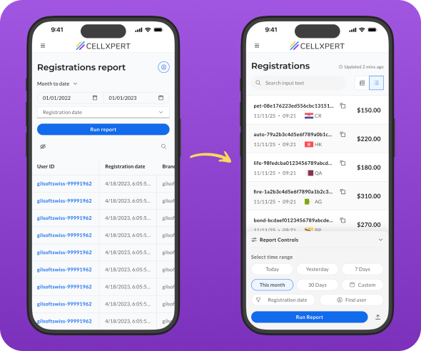
The report showed data — but gave no indication of when it was last updated. Affiliates had no way to know if what they were seeing was current or hours old.
Observred Users tapping "Update" repeatedly, hoping something would change
02
Filters were out of reach
The filters and search controls sat at the top of the screen — fine on desktop, completely impractical on mobile, where thumbs live at the bottom.
Observed → Low filter usage on mobile vs. desktop - a gap that shouldn't exist
03
A report that didn't fit the screen
The table had a large number of columns designed for desktop. On mobile, horizontal scrolling made it nearly impossible to understand the data as a whole.
Observed → Users scrolling horizontally, losing context, giving up mid-row
04
The lookup flow had no entry point
Many affiliates arrive at this report with a specific customer ID already in mind. The search for that ID was buried, adding unnecessary steps to the most common task.
Observred Users tapping "Update" repeatedly, hoping something would change
THE Design Challenge
How do we make a data-heavy report feel immediate, trustworthy, and effortless on a 6-inch screen, without sacrificing the depth that power users depend on?
how we approuched this
Constraints we worked within.Decisions we made.
Good design doesn't happen in a vacuum. Before touching a single screen, we aligned on what we could change, what we couldn't, and the principles that would guide every decision.
how we approached it
⚙️
Existing data structure
The report columns and data model were fixed. We couldn't remove data - we had to rethink how it was presented.
🧩
Shared component system
New patterns had to be buildable within the existing design system - or become reusable additions to it.
⚡
Engineering bandwidth
We prioritized changes with the highest UX impact-to-effort ratio. No rebuilds from scratch.
Principles we designed by
1
Thumb-first, always
Every primary action had to be reachable with one thumb, without shifting grip.
2
Trust before data
Before an affiliate reads a number, they need to believe it's current. Confidence in the data comes first.
3
Depth on demand
Show the essential, hide the rest — but never remove it. Power users should always be able to get more.
4
Respect the intent
Many users arrive with a specific goal. The interface should meet them where they are, not make them start from zero.
What we considered and didn't pursue
Persistent filter bar
Always visible but ate screen real estate and competed visually with the data. Rejected in favor of an on-demand drawer.
Horizontal card swipe
Felt native on mobile but obscured the full list context. Users couldn't scan - they could only drill. Bottom drawer + modal preserved both.
Forcing the quick search
Making the search page mandatory would frustrate users who don't arrive with a specific ID. We made it skippable - and rememberable.
The solutions
Four problems.Four decisions.
Each solution maps directly to a specific failure. Here's the logic behind each one.
01 - Trust
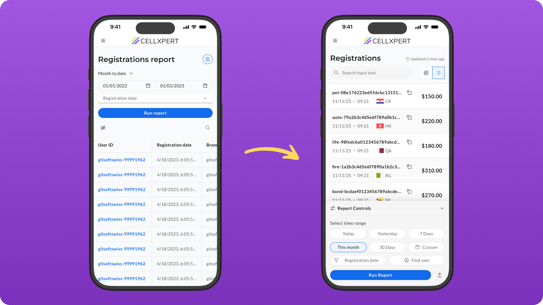
A timestamp that says "you can trust this."
The compulsive tapping of "Update" wasn't really about refreshing data - it was about anxiety. Affiliates didn't know if the data was 2 minutes old or 2 hours old, so they kept trying.
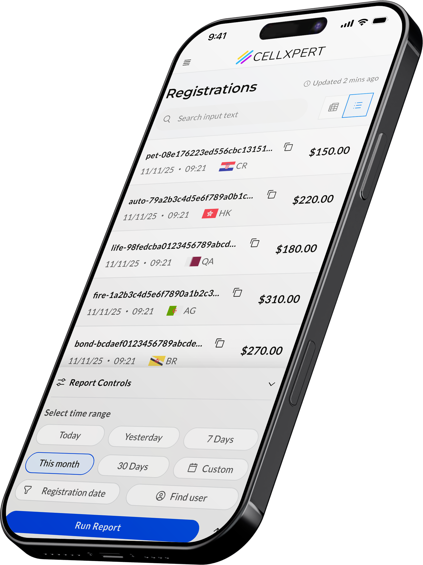
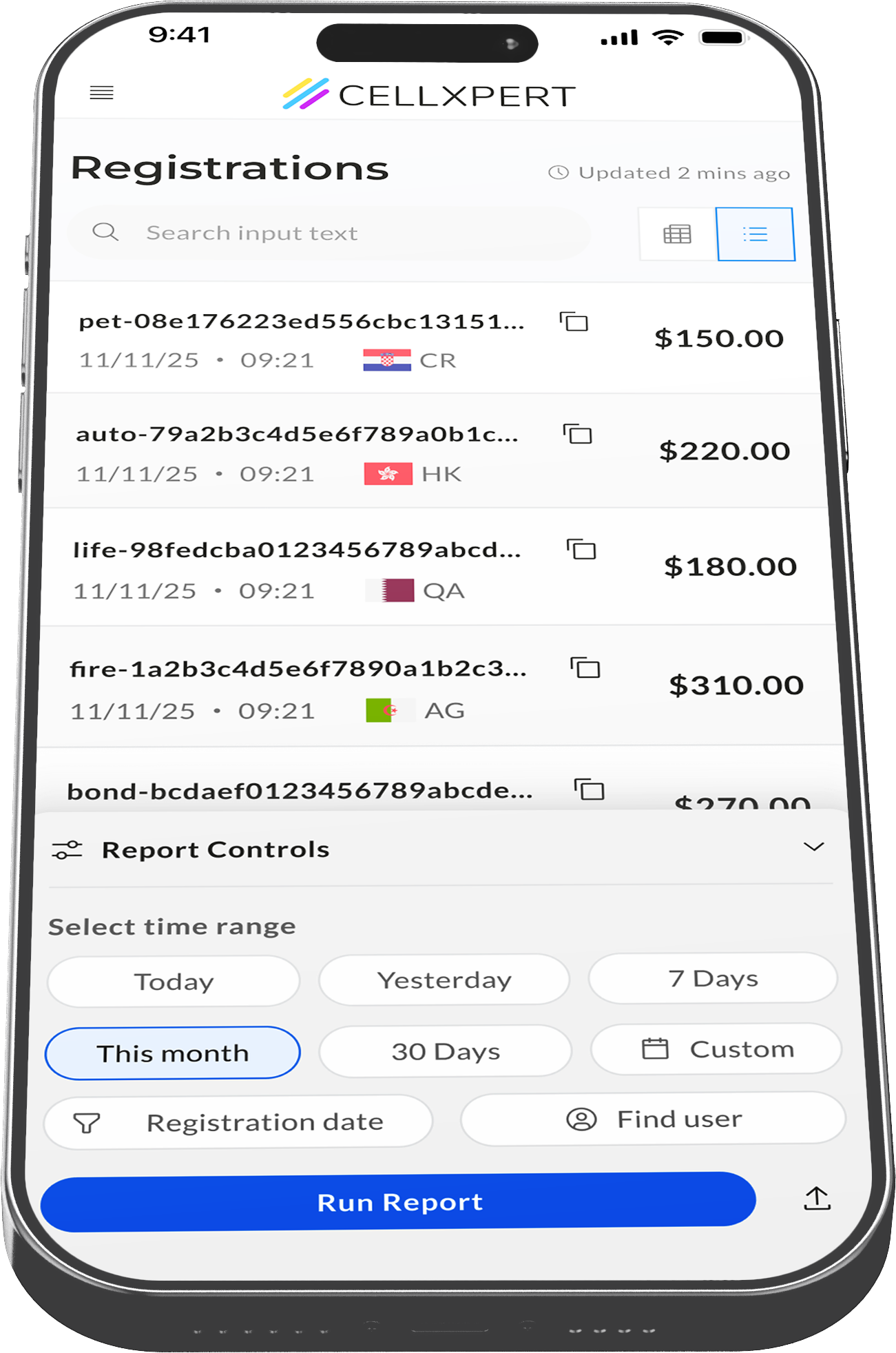
The fix was simple but deliberate: a persistent, human-readable timestamp - "Updated 3 minutes ago" - placed directly in the report header. Always visible. Always current.
DECISION
We used relative time ("3 minutes ago") rather than absolute ("09:14") because it answers the real question - "is this fresh?" - without requiring mental math.
02 - INTENT
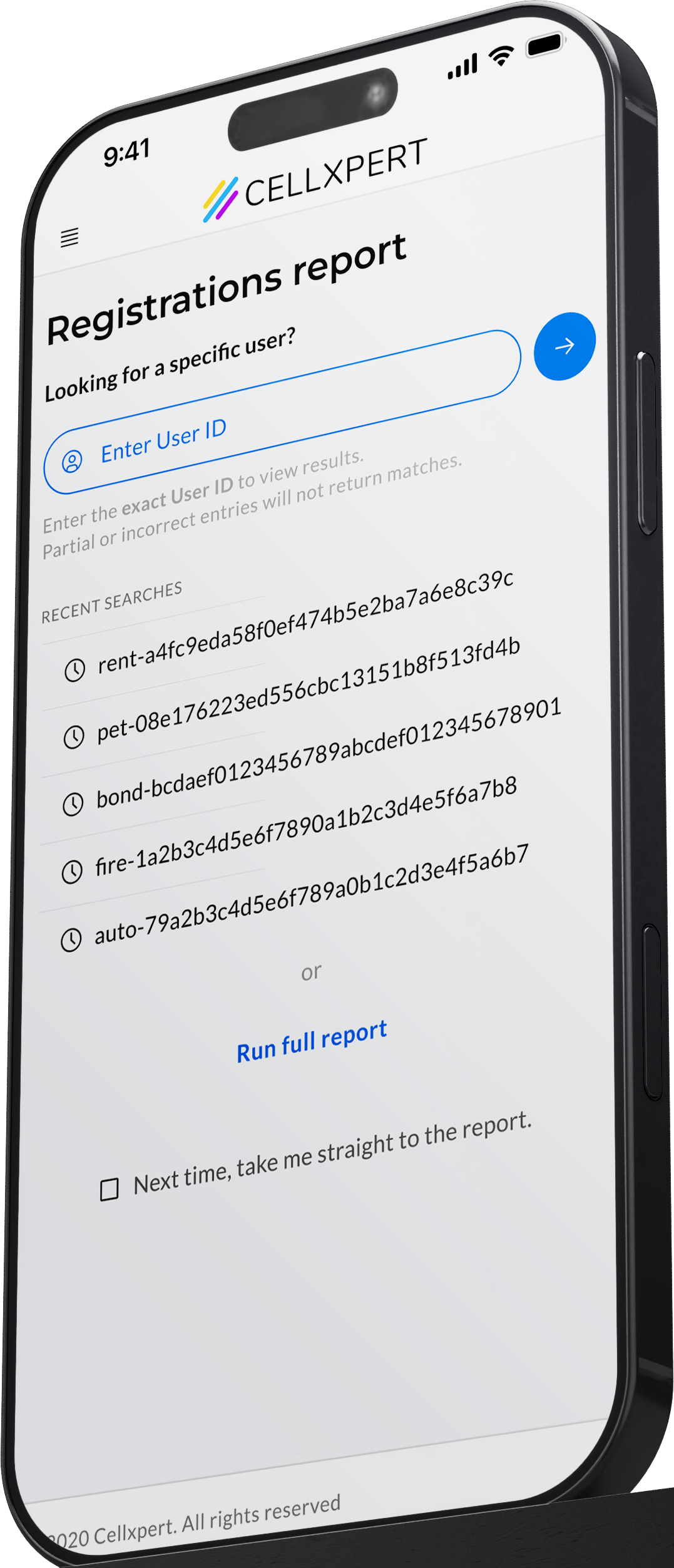
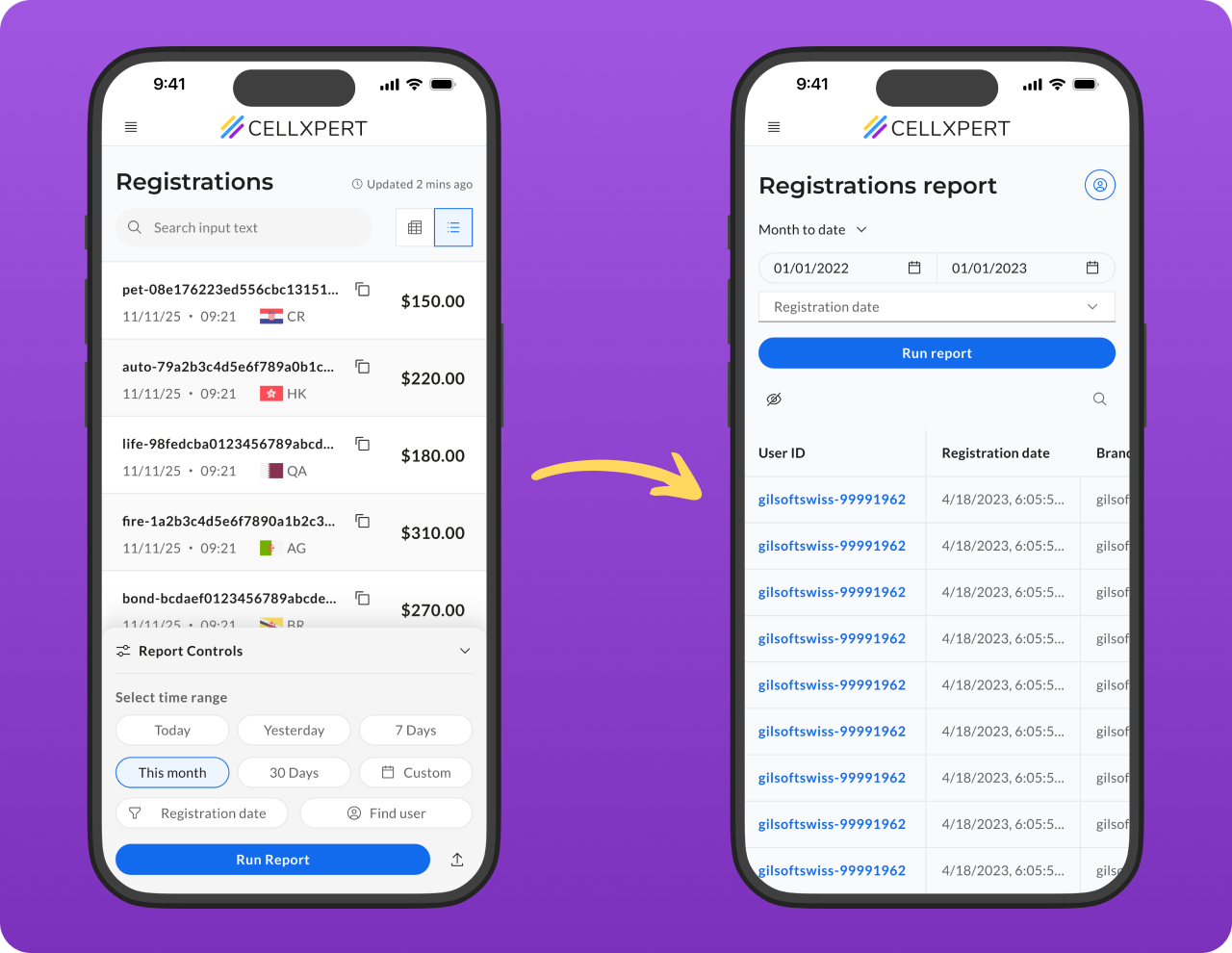
A search-first entry point for users who already know what they want.
A large portion of affiliates don't open this report to browse - they arrive with a specific customer ID already in hand. Maybe a client messaged them. Maybe they're verifying a specific lead. The old flow made them load the full report first, then search.
We introduced a dedicated quick-search screen at the start of the flow. Type the ID and get straight to the record. No filters, no noise.
DECISION
We added recent searches for quick re-access, and a "skip this page next time" toggle - so habitual users who browse the full report aren't penalised by the extra step.
03 - reach
Filters moved to where thumbs actually live.
The filters weren't broken - they were just in the wrong place. On desktop, top-of-page controls make sense. On mobile, reaching to the top of the screen requires a full grip shift, which most users simply don't do.
We moved the filters into a fixed bottom drawer - always accessible via a single tap from the bottom of the screen, then expanding into a full filter panel. The report stays visible behind it.
DECISION
The drawer stays collapsed by default so it never competes with the data. A subtle filter-count badge on the trigger shows when filters are active, so users always know if their view is narrowed.
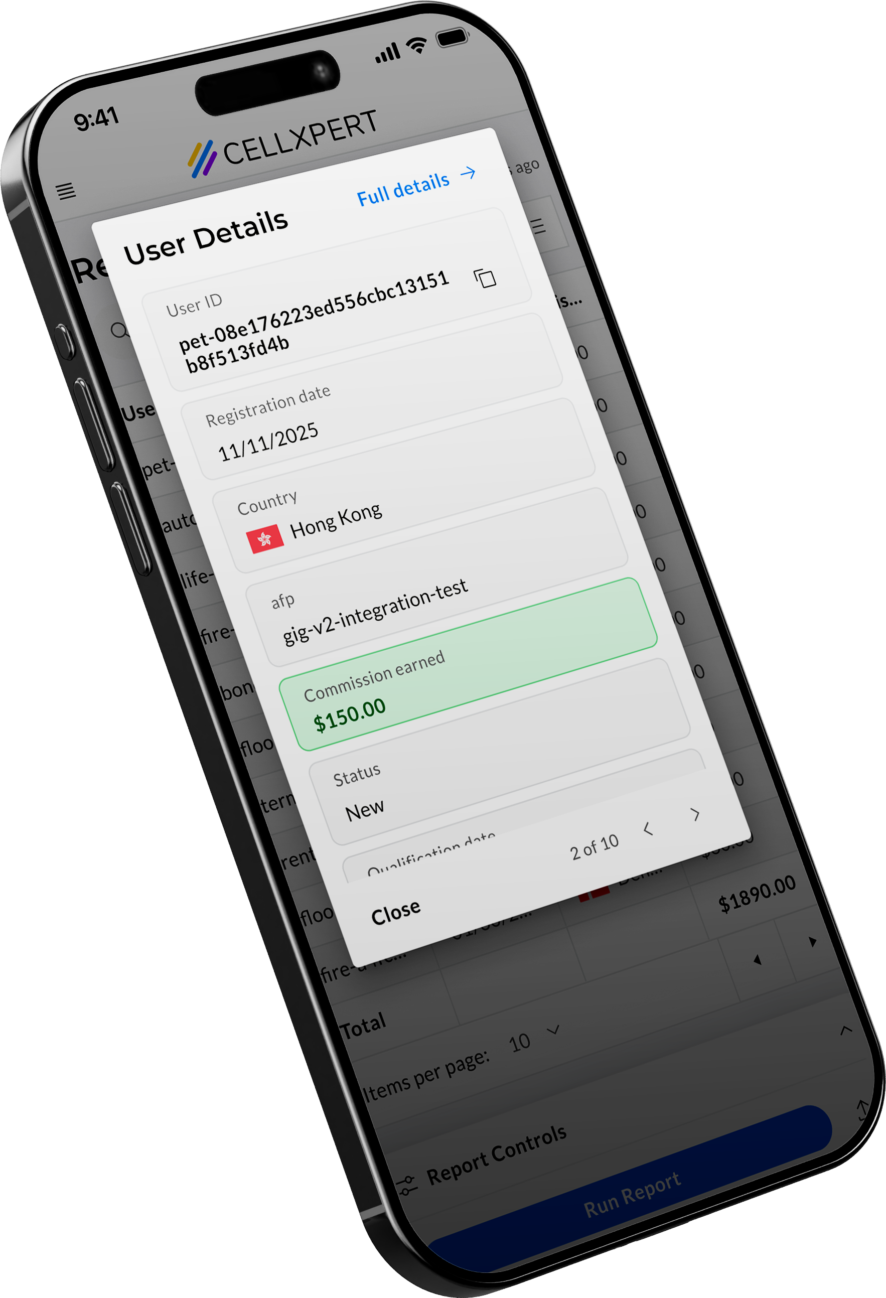
04 - Depth
The full picture,
one tap away.
The table had too many columns for any mobile screen to handle. Horizontal scrolling meant losing row context mid-data. Users couldn't hold a complete picture of any single registration.
We reduced the base table to 4 essential columns, the information needed to scan and identify. Tap any row and a modal surfaces all remaining data in a clean vertical list. No scrolling, no context loss.
DECISION
The modal also does work — copy any value with a tap, navigate between rows without going back to the table, or jump directly to the full customer profile. It's not just a data view. It's a mini workspace.
The Details
Built into the behavior,
not the screen.
The best UX decisions are invisible. You don't see them — you feel them. Here's what we built into the behavior.
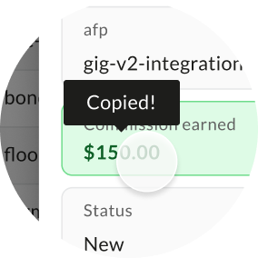
Copy on tap
Affiliates constantly need to paste IDs and emails into other tools: spreadsheets, CRMs, messages. Selecting text on mobile is a frustration. We made every field in the modal tappable to copy, confirmed by a brief toast.
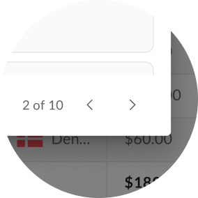
Row navigation
Auditing multiple registrations meant going back to the list, tapping again, waiting, repeat. Arrow controls inside the modal let you step through rows in sequence, full context always visible.
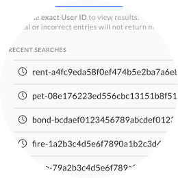
Recent searches
Affiliates often check the same IDs repeatedly: a returning lead, a flagged registration, a VIP. Recent searches surface the last lookups instantly, without retyping.
IMPACT
Four problems defined.
Four signals moved.
Each metric maps directly to a problem named at the start of this project. That's not a coincidence, it's what happens when you measure the right things before you design.
−72%
Rage clicks on the Update button
↑ Trust problem solved
The timestamp gave affiliates the reassurance they were looking for. The compulsive refresh behavior dropped dramatically within weeks of launch.
−55%
Support tickets on missing registrations
↑ Trust problem solved
A significant portion of "why can't I see my registration?" tickets were actually confusion about data freshness, not missing data. The timestamp resolved the anxiety before it became a support request.
+20%
Mobile filter & date range usage
↑ Reach problem solved
Moving controls to the bottom drawer made them reachable. Affiliates didn't stop wanting to filter — they just couldn't before. One layout change unlocked a behavior that was always there.
Unexpected finding
40% of users arrive with an ID in hand.
Before this project, we didn't have a clear picture of how many affiliates came to the report with a specific customer ID already in mind. The new quick-search entry screen gave us the data to measure it for the first time.
It turned out to be 4 in 10 sessions. Among those users, 95% actively used the search screen and recent searches, validating the entry point as a genuine workflow accelerator, not just a nice-to-have.
This finding has since informed how we think about entry points across other reports in the platform.


of sessions
40%
arrive with a specific ID
95%
of those users actively usedthe quick search or recent searches
Project Reflection
We set out to fix a frustrating report. We ended up learning something about how affiliates think. That kind of discovery doesn't come from the brief - it comes from paying attention to what people actually do.
Ido Alony
Projects

About

Resume

NEXT PROJECT
Admin UI Showcase - Rebuilt
A full platform rebuilt- modern tech, modern interface, and a clear answer to the question every admin was asking.
View Case Study

🔷 Affiliate Side
B2C Mobile
Use Case
The Report every affiliate checks first thing.
Redesigning the most-used mobile feature in the platform - from a source of daily frustration into a tool people actually trust
THE HUMAN
Meet the affiliate.
This is their morning.
"I sent traffic last night. First thing I do when I wake up — check if the registrations came through."
WHO THEY ARE
Performance marketers, media buyers, and content creators - often working independently or in small teams
THEIR CONTEXT
Mostly on mobile. Checking data between meetings, on commutes, first thing in the morning
What they care about
Performance marketers, media buyers, and content creators - often working independently or in small teams
THE PROBLEM
Four small failures.
One broken experience.
01
No signal that data was fresh
The report showed data — but gave no indication of when it was last updated. Affiliates had no way to know if what they were seeing was current or hours old.
Observred Users tapping "Update" repeatedly, hoping something would change
02
Filters were out of reach
The filters and search controls sat at the top of the screen — fine on desktop, completely impractical on mobile, where thumbs live at the bottom.
Observed → Low filter usage on mobile vs. desktop - a gap that shouldn't exist
03
A report that didn't fit the screen
The table had a large number of columns designed for desktop. On mobile, horizontal scrolling made it nearly impossible to understand the data as a whole.
Observed → Users scrolling horizontally, losing context, giving up mid-row
04
The lookup flow had no entry point
Many affiliates arrive at this report with a specific customer ID already in mind. The search for that ID was buried, adding unnecessary steps to the most common task.
Observred Users tapping "Update" repeatedly, hoping something would change
THE Design Challenge
How do we make a data-heavy report feel immediate, trustworthy, and effortless on a 6-inch screen, without sacrificing the depth that power users depend on?
how we approuched this
Constraints we worked within.Decisions we made.
Good design doesn't happen in a vacuum. Before touching a single screen, we aligned on what we could change, what we couldn't, and the principles that would guide every decision.
how we approached it
⚙️
Existing data structure
The report columns and data model were fixed. We couldn't remove data - we had to rethink how it was presented.
🧩
Shared component system
New patterns had to be buildable within the existing design system - or become reusable additions to it.
⚡
Engineering bandwidth
We prioritized changes with the highest UX impact-to-effort ratio. No rebuilds from scratch.
Principles we designed by
1
Thumb-first, always
Every primary action had to be reachable with one thumb, without shifting grip.
2
Trust before data
Before an affiliate reads a number, they need to believe it's current. Confidence in the data comes first.
3
Depth on demand
Show the essential, hide the rest — but never remove it. Power users should always be able to get more.
4
Respect the intent
Many users arrive with a specific goal. The interface should meet them where they are, not make them start from zero.
how we approached it
⚙️
Existing data structure
The report columns and data model were fixed. We couldn't remove data - we had to rethink how it was presented.
🧩
Shared component system
New patterns had to be buildable within the existing design system - or become reusable additions to it.
⚡
Engineering bandwidth
We prioritized changes with the highest UX impact-to-effort ratio. No rebuilds from scratch.
What we considered and didn't pursue
Persistent filter bar
Always visible but ate screen real estate and competed visually with the data. Rejected in favor of an on-demand drawer.
Horizontal card swipe
Felt native on mobile but obscured the full list context. Users couldn't scan - they could only drill. Bottom drawer + modal preserved both.
Forcing the quick search
Making the search page mandatory would frustrate users who don't arrive with a specific ID. We made it skippable - and rememberable.
The solutions
Four problems.Four decisions.
Each solution maps directly to a specific failure. Here's the logic behind each one.
01 - Trust
A timestamp that says "you can trust this."
The compulsive tapping of "Update" wasn't really about refreshing data - it was about anxiety. Affiliates didn't know if the data was 2 minutes old or 2 hours old, so they kept trying.
The fix was simple but deliberate: a persistent, human-readable timestamp - "Updated 3 minutes ago" - placed directly in the report header. Always visible. Always current.
DECISION
We used relative time ("3 minutes ago") rather than absolute ("09:14") because it answers the real question - "is this fresh?" - without requiring mental math.
02 - INTENT
A search-first entry point for users who already know what they want.
A large portion of affiliates don't open this report to browse - they arrive with a specific customer ID already in hand. Maybe a client messaged them. Maybe they're verifying a specific lead. The old flow made them load the full report first, then search.
We introduced a dedicated quick-search screen at the start of the flow. Type the ID and get straight to the record. No filters, no noise.
DECISION
We added recent searches for quick re-access, and a "skip this page next time" toggle - so habitual users who browse the full report aren't penalised by the extra step.
03 - reach
Filters moved to where thumbs actually live.
The filters weren't broken - they were just in the wrong place. On desktop, top-of-page controls make sense. On mobile, reaching to the top of the screen requires a full grip shift, which most users simply don't do.
We moved the filters into a fixed bottom drawer - always accessible via a single tap from the bottom of the screen, then expanding into a full filter panel. The report stays visible behind it.
DECISION
The drawer stays collapsed by default so it never competes with the data. A subtle filter-count badge on the trigger shows when filters are active, so users always know if their view is narrowed.
04 - Depth
The full picture,
one tap away.
The table had too many columns for any mobile screen to handle. Horizontal scrolling meant losing row context mid-data. Users couldn't hold a complete picture of any single registration.
We reduced the base table to 4 essential columns, the information needed to scan and identify. Tap any row and a modal surfaces all remaining data in a clean vertical list. No scrolling, no context loss.
DECISION
The modal also does work — copy any value with a tap, navigate between rows without going back to the table, or jump directly to the full customer profile. It's not just a data view. It's a mini workspace.
The Details
Built into the behavior,
not the screen.
The best UX decisions are invisible. You don't see them — you feel them. Here's what we built into the behavior.
Copy on tap
Affiliates constantly need to paste IDs and emails into other tools: spreadsheets, CRMs, messages. Selecting text on mobile is a frustration. We made every field in the modal tappable to copy, confirmed by a brief toast.
Row navigation
Auditing multiple registrations meant going back to the list, tapping again, waiting, repeat. Arrow controls inside the modal let you step through rows in sequence, full context always visible.
Recent searches
Affiliates often check the same IDs repeatedly: a returning lead, a flagged registration, a VIP. Recent searches surface the last lookups instantly, without retyping.
IMPACT
Four problems defined.
Four signals moved.
Each metric maps directly to a problem named at the start of this project. That's not a coincidence, it's what happens when you measure the right things before you design.
−72%
Rage clicks on the Update button
↑ Trust problem solved
The timestamp gave affiliates the reassurance they were looking for. The compulsive refresh behavior dropped dramatically within weeks of launch.
−55%
Support tickets on missing registrations
↑ Trust problem solved
A significant portion of "why can't I see my registration?" tickets were actually confusion about data freshness, not missing data. The timestamp resolved the anxiety before it became a support request.
+20%
Mobile filter & date range usage
↑ Reach problem solved
Moving controls to the bottom drawer made them reachable. Affiliates didn't stop wanting to filter — they just couldn't before. One layout change unlocked a behavior that was always there.
THE Design Challenge
40% of users arrivewith an ID in hand.
Before this project, we didn't have a clear picture of how many affiliates came to the report with a specific customer ID already in mind. The new quick-search entry screen gave us the data to measure it for the first time.
It turned out to be 4 in 10 sessions. Among those users, 95% actively used the search screen and recent searches, validating the entry point as a genuine workflow accelerator, not just a nice-to-have.
This finding has since informed how we think about entry points across other reports in the platform.
of sessions
40%
arrive with a specific ID
95%
of those users actively usedthe quick search or recent searches
Project Reflection
We set out to fix a frustrating report. We ended up learning something about how affiliates think. That kind of discovery doesn't come from the brief - it comes from paying attention to what people actually do.
NEXT PROJECT
Admin UI Showcase - Rebuilt
A full platform rebuilt- modern tech, modern interface, and a clear answer to the question every admin was asking.
View Case Study
Ido Alony
🔷 Affiliate Side
B2C Mobile
Use Case
The Report every affiliate checks first thing.
Redesigning the most-used mobile feature in the platform - from a source of daily frustration into a tool people actually trust
THE HUMAN
Meet the affiliate.
This is their morning.
"I sent traffic last night. First thing I do when I wake up — check if the registrations came through."
WHO THEY ARE
Performance marketers, media buyers, and content creators - often working independently or in small teams
THEIR CONTEXT
Mostly on mobile. Checking data between meetings, on commutes, first thing in the morning
What they care about
Performance marketers, media buyers, and content creators - often working independently or in small teams
THE PROBLEM
Four small failures.
One broken experience.
01
No signal that data was fresh
The report showed data — but gave no indication of when it was last updated. Affiliates had no way to know if what they were seeing was current or hours old.
Observed → Users tapping "Update" repeatedly, hoping something would change
02
Filters were out of reach
The filters and search controls sat at the top of the screen — fine on desktop, completely impractical on mobile, where thumbs live at the bottom.
Observed → Low filter usage on mobile vs. desktop - a gap that shouldn't exist
03
A report that didn't fit the screen
The table had a large number of columns designed for desktop. On mobile, horizontal scrolling made it nearly impossible to understand the data as a whole.
Observed → Users scrolling horizontally, losing context, giving up mid-row
04
The lookup flow had no entry point
Many affiliates arrive at this report with a specific customer ID already in mind. The search for that ID was buried, adding unnecessary steps to the most common task.
Observed → Users navigating multiple steps to complete what should be a quick lookup
THE Design Challenge
How do we make a data-heavy report feel immediate, trustworthy, and effortless on a 6-inch screen, without sacrificing the depth that power users depend on?
how we approached it
Constraints we worked within.Decisions we made.
Good design doesn't happen in a vacuum. Before touching a single screen, we aligned on what we could change, what we couldn't, and the principles that would guide every decision.
how we approached it
⚙️
Existing data structure
The report columns and data model were fixed. We couldn't remove data - we had to rethink how it was presented.
🧩
Shared component system
New patterns had to be buildable within the existing design system - or become reusable additions to it.
⚡
Engineering bandwidth
We prioritized changes with the highest UX impact-to-effort ratio. No rebuilds from scratch.
Principles we designed by
1
Thumb-first, always
Every primary action had to be reachable with one thumb, without shifting grip.
2
Trust before data
Before an affiliate reads a number, they need to believe it's current. Confidence in the data comes first.
3
Depth on demand
Show the essential, hide the rest — but never remove it. Power users should always be able to get more.
4
Respect the intent
Many users arrive with a specific goal. The interface should meet them where they are, not make them start from zero.
What we considered and didn't pursue
Persistent filter bar
Always visible but ate screen real estate and competed visually with the data. Rejected in favor of an on-demand drawer.
Horizontal card swipe
Felt native on mobile but obscured the full list context. Users couldn't scan - they could only drill. Bottom drawer + modal preserved both.
Forcing the quick search
Making the search page mandatory would frustrate users who don't arrive with a specific ID. We made it skippable - and rememberable.
The solutions
Four problems.Four decisions.
Each solution maps directly to a specific failure. Here's the logic behind each one.
01 - Trust
A timestamp that says "you can trust this."
The compulsive tapping of "Update" wasn't really about refreshing data - it was about anxiety. Affiliates didn't know if the data was 2 minutes old or 2 hours old, so they kept trying.
The fix was simple but deliberate: a persistent, human-readable timestamp - "Updated 3 minutes ago" - placed directly in the report header. Always visible. Always current.
DECISION
We used relative time ("3 minutes ago") rather than absolute ("09:14") because it answers the real question - "is this fresh?" - without requiring mental math.
02 - INTENT
A search-first entry point for users who already know what they want.
A large portion of affiliates don't open this report to browse - they arrive with a specific customer ID already in hand. Maybe a client messaged them. Maybe they're verifying a specific lead. The old flow made them load the full report first, then search.
We introduced a dedicated quick-search screen at the start of the flow. Type the ID and get straight to the record. No filters, no noise.
DECISION
We added recent searches for quick re-access, and a "skip this page next time" toggle - so habitual users who browse the full report aren't penalised by the extra step.
03 - reach
Filters moved to where thumbs actually live.
The filters weren't broken - they were just in the wrong place. On desktop, top-of-page controls make sense. On mobile, reaching to the top of the screen requires a full grip shift, which most users simply don't do.
We moved the filters into a fixed bottom drawer - always accessible via a single tap from the bottom of the screen, then expanding into a full filter panel. The report stays visible behind it.
DECISION
The drawer stays collapsed by default so it never competes with the data. A subtle filter-count badge on the trigger shows when filters are active, so users always know if their view is narrowed.
04 - Depth
The full picture,
one tap away.
The table had too many columns for any mobile screen to handle. Horizontal scrolling meant losing row context mid-data. Users couldn't hold a complete picture of any single registration.
We reduced the base table to 4 essential columns, the information needed to scan and identify. Tap any row and a modal surfaces all remaining data in a clean vertical list. No scrolling, no context loss.
DECISION
The modal also does work — copy any value with a tap, navigate between rows without going back to the table, or jump directly to the full customer profile. It's not just a data view. It's a mini workspace.
The Details
Built into the behavior,
not the screen.
The best UX decisions are invisible. You don't see them — you feel them. Here's what we built into the behavior.
Copy on tap
Affiliates constantly need to paste IDs and emails into other tools: spreadsheets, CRMs, messages. Selecting text on mobile is a frustration. We made every field in the modal tappable to copy, confirmed by a brief toast.
Row navigation
Auditing multiple registrations meant going back to the list, tapping again, waiting, repeat. Arrow controls inside the modal let you step through rows in sequence, full context always visible.
Recent searches
Affiliates often check the same IDs repeatedly: a returning lead, a flagged registration, a VIP. Recent searches surface the last lookups instantly, without retyping.
IMPACT
Four problems defined.
Four signals moved.
Each metric maps directly to a problem named at the start of this project. That's not a coincidence, it's what happens when you measure the right things before you design.
−72%
Rage clicks on the Update button
↑ Trust problem solved
The timestamp gave affiliates the reassurance they were looking for. The compulsive refresh behavior dropped dramatically within weeks of launch.
−55%
Support tickets on missing registrations
↑ Trust problem solved
A significant portion of "why can't I see my registration?" tickets were actually confusion about data freshness, not missing data. The timestamp resolved the anxiety before it became a support request.
+20%
Mobile filter & date range usage
↑ Reach problem solved
Moving controls to the bottom drawer made them reachable. Affiliates didn't stop wanting to filter — they just couldn't before. One layout change unlocked a behavior that was always there.
Unexpected finding
40% of users arrivewith an ID in hand.
Before this project, we didn't have a clear picture of how many affiliates came to the report with a specific customer ID already in mind. The new quick-search entry screen gave us the data to measure it for the first time.
It turned out to be 4 in 10 sessions. Among those users, 95% actively used the search screen and recent searches, validating the entry point as a genuine workflow accelerator, not just a nice-to-have.
This finding has since informed how we think about entry points across other reports in the platform.
of sessions
40%
arrive with a specific ID
95%
of those users actively usedthe quick search or recent searches
Project Reflection
We set out to fix a frustrating report. We ended up learning something about how affiliates think. That kind of discovery doesn't come from the brief - it comes from paying attention to what people actually do.
NEXT PROJECT
Admin UI Showcase - Rebuilt
A full platform rebuilt- modern tech, modern interface, and a clear answer to the question every admin was asking.
View Case Study